Thursday, June 30, 2011

every camera I own: the blackbird, fly 35mm twin-lens reflex (orange)

Market strategy for the Blackbird, Fly (yes, its name has a comma; yes, that's awfully precious) would have you believe that "many TLRs are hundreds of dollars," which I guess is true if you want a Rolleiflex. But you can easily get, say, a Yashica A (or two!) on eBay for less than the Franklin and change that this camera, comma, will set you back.

And yet when I saw one at the ICP Store, long before they'd turn up at Urban Outfitters, I grabbed it. After all, it was in my favorite color. It's a cute little plastic bastard, and comes elaborately packaged in a hip cardboard box with a hip plastic bell enclosing it like hip pheasant comma under glass. Really comma I hadn't noticed that affected comma before comma but it is certainly the kind of minute annoyance upon which one can become fixated comma isn't it.

I loaded it for the very first time about a week ago, nearly three years after it was introduced.

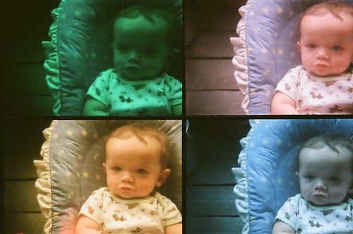
The Blackbird Comma Fly is modelled after the classic Twin Lens Reflex design, but takes 35mm film which you can use in three different formats: with a square or rectangular mask, or without the mask, which is supposed to let the image bleed onto the film sprockets for a larger square negative. I shot a roll of expired Kodak "High Definition" 400 that I acquired from some Flickr group that was handing out expired film, some of it crappy (what I loaded the B,F with), but some of it pretty good - varieties of Kodak's VC and NC (Vivid Color and Natural Color)  Portra stocks.

I shot the B,F without a mask because I am photographically  naked like that, but the Walgreen's where I have been taking my disposable and toy 35mm pictures for developing printed them oblongatic anyway.

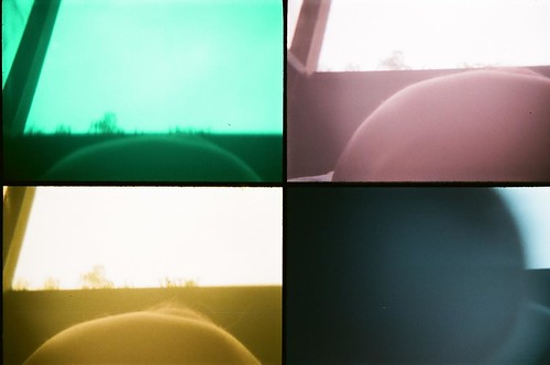
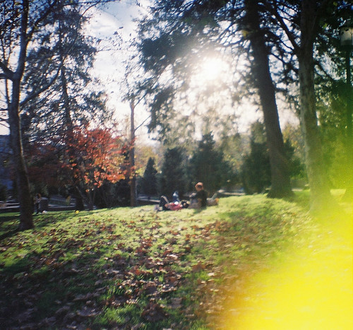
I thought 400 ASA film would be too fast for the camaera and I'd end up with blown highlights, but the lens specs beg to differ: a 1/125 shutter speed and an f7 or f11 aperture (never could move the lever that changes them) left me underexposed   on an overcast day:

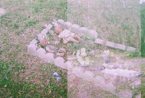
Loews parking lot, Front Royal, VA.

I often forget that toy cameras have setting for normal exposure and bulb exposure - the former of which has a normal shutter speed (1/125 sec. in this case), the latter of which holds the shutter open as long as the shutter release is pressed.  I have a few very blurry pictures of my nephew as testament.

An under-exposed but not blurry photo of my nephew.

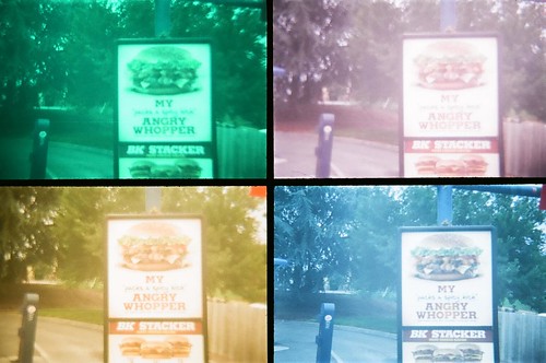
I was excited to see how these pictures would turn out, and so in full "let's finish off the roll on random stuff near the photo lab," I burned nine frames at and around Walgreens.


It is perhaps not a story for the ages, but it is my story.

Monday, June 27, 2011

better than a million Step Up 3s: NY Export Opus Jazz

A bonus review this week. Article first published as DVD Review: NY Export: Opus Jazz on Blogcritics.

NY Export: Opus Jazz proudly announces itself as the first film conceived, created, produced and danced by the New York City Ballet. But the film’s directors have some creative cachet as well. Co-directors Henry Joost and Jody Lee Lipes came fresh from very different projects: Joost was part of the team that brought you the controversial Catfish (his co-director and co-star of that film, Ariel Schulman, is production designer here), and Lipes made the fascinating documentary Good Times Will Never be the Same, about controversial artist Brock Enright. Whatever you think of those films, Opus Jazz may not be what you expect.

Jane Jacobs wrote of the city as an “intricate ballet, in which the individual dancers and ensembles all have distinctive parts which miraculously reinforce each other and compose an orderly whole.” The work of choreographer Jerome Robbins could be seen as a stylish embodiment of that romantic ideal. Robbins’ NY Export: Opus Jazz was envisioned as a companion piece to his work in West Side Story, and the paralells are clear in the kind of gangland tension and young sexuality, lines both flowing and staccato.
Lipes’ Good Times proved the cinematographer-turned director’s gift for the casual detail, carefully composed but still intimate and organic. His camerawork throughout is as impressive as you’d expect from the Brock Enright film, expansive or contemplative when needed, with a few stagelight lens flares thrown in for a sparing touch of the spotlight. The wide-angle lens used for most of the dance sequences give the performers room to breathe, and don’t make the mistake that dance films sometimes do of cutting away too much from the performers bodies. The aspect ratio is so wide that the film would be wonderful to see on a big movie screen.

The film was shot in various locations in New York, from old-school diners to the McCarren Park Pool to a stretch of the High Line before it was cleared, when it was more of a wild park than the manicured lawn it is now. The music by Robert Prince is full of youthful, brassy outbursts, and the young performers of the New York City Ballet are a joy to watch. Now if somebody can do this with Charles Mingus’ The Black Saint and the Sinner Lady, perhaps live in an abandoned warehouse, I promise full Stendahl Syndrome overload.

A featurette included with the DVD traces the history of this “ballet in sneakers” from its performance on the Ed Sullivan Show to its revival for a modern audience. If you love dance, jazz, and New York - or even if you only love two of the three - this is a must-see. And if you’re anywhere near a screening - the film is still making its way through the festival circuit - I envy you.

Sunday, June 26, 2011

photobook review: ed van der elsken, love on the left bank

Article first published as Book Review: Love on the Left Bank by Ed van der Elsken on Blogcritics.

Publishers have responded to the demand for collectible photobooks in a variety of ways. Errata Editions reissues highly valued titles, but resizes them to fit a uniform template. Not that I don't want the whole collection. The reissue efforts of Dewi Lewis Publishing may not have the depths of the growing Errata catalog (up to a dozen and counting in the Books on Books series), but they have created magnifiicent facsimiles of a number of classic photo books, from William Klein’s New York (its reissue now out-of-print and collectible) to Martin Parr’s The Last Resort (reviewed here last month), to this week’s title.

Dutch photographer Edward van Elsken published over 20 photobooks in his lifetime. His 1956 classic Love on the Left Bank is a fine example of the photobook as visual literature, for in spirit and texture it comes off as a marriage between Kerouac’s On the Road and Robert Frank’s The Americans (separate if related works - advantage Frank).

This fictionalized book-length photo essay follows the ill-fated love affair of a Mexican hitchhiker with a woman of Paris named Ann against the backdrop of a Left Bank that was then one of the great epicenters of art and culture. High-contrast, grainy black and white film captures the excitement and energy of youth and the city, and the varied page layouts keep the narrative moving. Spreads of jagged smaller panels feature plenty of white space, and Parisian shop-fronts that look as if they were made by an Atget who didn’t have time to stop and dream. These alternate with full-bleed two-page closeups of lovers and other strangers. The images are at once historical and timeless, though some of the Gill Sans-laid text has dated, with exchanges like, “You dance like an African negress” answered by “I’d like to have a child by a negro.”


“Ann” was actually Australian-born dancer/artist Vali Myers, who moved to Paris in 1949 and lived at New York’s infamous Chelsea hotel for a while - a few of her paintings in fact still adorn the hotel's storied walls. Myers’ drawings are featured throughout the book as well. If Woody Allen’s Midnight in Paris transports you to the Paris of the twenties, then the gritty photos and rhythmic page layouts of Love on the Left Bank will transport you to 1956.

Friday, June 24, 2011

every camera I own: the diana mini

The Diana Mini is based on a classic plastic camera design from the 1960s. The Diana and her many variations took 120 sized film,  and were/are not known for build quality - and that includes the Lomo "reissue." The revamped, rainbow Diana line included a limited edition red-and-white Meg White Diana set which I didn't expect to win on eBay. In 2009 Lomo introduced a Diana that used 35mm film - a smaller package than the medium-format Diana+ that of course cost twenty percent more and was no less a flimsy maiden who needed protein.  Maybe she is fragile because she is hunted. I could write about her as if she were a pony: I didn't think it would take long before I broke her. And it didn't. Before we sailed over the second hurdle etc etc glue factory. But she had true grit after all.

What happened was the shutter release at the side of the lens lost its shiny knob just before I loaded it for this project. And by "lost" I mean "it broke off when I tested it."

With a 24mm lens, it's a wider angle than most toy cameras. I've only used it once before, and apparently it leaked a lot:

Some kind of expired 400 ASA (probably too fast for it) Kodak stock. Malcolm X Park, Washington, DC.

Last week I loaded it with fresh Fuji 200. You can't tell in the above picture, but throw this 24mm lens some straight lines, and it throws back barrel distortion:

69950019


And, on occasion, frame advance issues:

69950014


Crappy scans courtesy of Walgreen's, where the film pick-up bins are never full.

69950015

Monday, June 20, 2011

photobook review: paul graham, beyond caring (books on books)

Article first published as Book Review: Beyond Caring (Books on Books) by Paul Graham on Blogcritics.

Paul Graham’s 1986 photobook Beyond Caring was made with the same instrument - the Plaubel Makina 6X7 - Martin Parr used for his photobook The Last Resort, originally released in the same year and reviewed here a few weeks ago. But the results could not be further apart.

Both trained an eye on Thatcher England, but while Parr found the lively and garish color in the middle-class on vacation, Graham paints a much darker, and perhaps more accurate picture of the state of the nation. In 1985 and 1986, Graham visited Social Security offices throughout England. He applied for permission from the DHSS, but was denied; so he surreptitiously made pictures without looking through the viewfinder - propping the camera on chairs or floors, holding it at waist level. The resulting compositions - skewed, voyeuristic - reflect a life out of balance. The Plaubel-Makina is a rangefinder and thus does not make the conspicuous ka-chunk of an SLR, so his subjects are unaware of and unaffected by his presence. What they are affected by is the tedium and desperation of bleak and sometimes filthy government offices, usually crowded and understaffed, where waits could last up to three hours and the payoff could be zero.

Graham came out of a school of New Color photographers in Britain, of which Parr is the most famous. But Graham’s eye is more socially conscious than his contemporaries’. Errata Editions reissued this book in their standard format - a facsimile that reproduces page layouts of the published tome. A frequent complaint made about this strategy is that the pictures lose some impact - more than usual in the case of Beyond Caring, a landscape-oriented paperback reissued as a portrait-landscape hardback. But Errata is to be lauded for making rare photobooks available for a fraction of their cost on the collectors’ market (originals of Beyond Caring go for $900!), developing an affordable library of classic and contemporary photography.

Thursday, June 16, 2011

every camera i own: pingo

This post is not brought to you by Mr. Popper's Penguins, coincidentally in theaters now.

I don't remember how I found Pingo, only that I got him on eBay. He's your basic point-and-shoot 35mm plastic camera, with a little lever on his belly that slides a protective shield over the lens when not in use. I don't know why you'd need to protect the lens, but whatever.

I recently took a picture of a friend who asked me why I was taking his picture with a blackface jockey. I'd never made the connection before but Pingo has a cap and everything. Who knew?

As a photographic instrument, Pingo has no distinctive characteristics. But, he's a penguin.  And he's also the first camera with which I captured something that in some circles can be interpreted as ghost like:


I wrote about the incident on my ghost blog. I've long neglected my ghost blog, but it's not for lack of stories. My niece has been asking for more ghost stories so I'll try to come up with something soon. Anyway, because of the streaks of what resemble classic "ghost" images of ectoplasm, I've brough Pingo to reportedly haunted places to see if he can conjure up spirits. He hasn't yet. Before dusting him off for this project, I'd last used him in another haunted spot in Florida, the old Spring Hill Cemetery, which I wrote about here.

111950-R1-13


Pingo was having frame advance issues on this occasion, but the fresh roll of film I loaded him with last week came off without a hitch. Even though I took it to a supposedly haunted building.

68700017


My niece - the one who asked for more ghost stories - is trying to overcome her fear of ghosts. She has been known to shudder at the very mention of the g-word, but I've also known seen her watching one of the Harry Potter movies, and, when the soul-sucking dementors appear, I caught her cracking a smile.

The first haunted place I could think of that would be open on a Sunday was the Old Stone House in Georgetown, but that wasn't very convenient for our plans. My sister-in-law suggested the National Building Museum, formerly the Pension Building, which I'd forgotten about - I'd even taken a ghost tour, hosted by a fictionalized Mary Surratt. The former Surratt  boarding house is a few blocks away, and its former proprietor reportedly haunts the sushi place that currently occupies the space.

Anyway, there are stories of spectral faces appearing between the former Pension Building's majestic columns, and even a  haunting by Buffalo Bill Cody. But we didn't see anything, and my niece, who took pictures hoping to capture something spooky, was sorely disappointed.

68700007


Then we found ourselves in an office area that I'd remembered from the tour. The suite once housed the offices of the Pension Commissioner, one of whom, James Tanner, reportedly haunts the building.

The space felt strange to me - I kept feeling like somebody was behind me. But my pictures didn't reveal anything out of the ordinary.

Sunday, June 12, 2011

gahd forgeeve me!

Gahd forgeeve me!
Photo by Pat Padua.
I wrote more than 3000 words for the DCist last week, including a roundup of this week's new and repertory movies and a review of the Kandinsky/Stella exhibits that just opened at the Phillips Collection.  Those were on my docket as the week began. But when I woke up Sautrday, I didn't plan to write a 1200-word report on the first live stage reading (with original cast members) of The Room at the AFI Silver. But I did, and you can read it here.

See my set of pictures from The Room Live on flickr.

photobook review: notes on fulford's raising frogs for $ $ $

Article first published as Book Review: Notes on Fulford's Raising Frogs for $ $ $ by Jason Fulford on Blogcritics.

Jason Fulford’s monographs continue to push the limits of what is possible with the photobook, while remaining squarely within the tradition of the book. Last year's The Mushroom Collector is the  culmination-to-date of his elliptical, intelligent sequencing, but it’s hard to beat his previous book, Raising Frogs for $ $ $, for boldly retro design. An appendix is available for the now out of print The Mushroom Collector, and now The Ice Plant has published a Cliff’s Notes inspired supplement to Frogs, still in catalog. Notes on Fulford’s Raising Frogs for $ $ $, which can be purchased directly from the publisher, is a slim, spare volume that nonetheless raises substantial questions about art. It shares design and structural elements with traditional Cliff’s Notes but departs from them in essence: it does not provide a synopsis of its source, nor does it really try to explain the work. Which is as it should be.

“The current publication is not meant to supplant any reader’s personal impression or interpretation of Frogs, nor should it in any way substitute for a direct, immersive experience with the pages of the book, preferably over a long period of time, throughout different stages of one’s life.” That last clause can be taken as a sly reference to the stages of frog growth, but it is also something said about works of great literature, particularly Don Quixote, which they say should be read as a young man, in middle age, and then in one's golden years. I read Quixote in college, and am coming to the age when I better recognize the persistence of delusions, about one’s self and the world; and when I realize that the windmills at which we tilt are merely our own shadows.

Anyway. The first chapter of Notes on Fulford’s Raising Frogs for $ $ $ is not a summary of the book in question but an introduction of concepts: “Exercises in editing” examines pattern integrity and the way we make associations in a dryly funny way that is instructive without being pedantic. A fascinating suggested reading list includes Soren Kierkegaard, F. Scott Fitzgerald, Samuel Beckett, and Harry Matthew’s Oulipo Compendium. Finally, sutdy questions are provided, which ask Cliff’s style questions like “In what ways are chapters IV and VI of Raising Frogs for $ $ $ similar, and in what ways do they differ,” but also ask that we ponder “Did you know in Korea, the number 4 is bad luck, and that in elevators, the fourth floor is marked “F”? To be honest, it would take longer to explain Notes on Fulford’s Raising Frogs for $ $ $, than it would take to read the book, and my explanation would not be half as brilliant. I won’t spoil any more of the surprises in this slight but thought-provoking publication. These Notes may not help you pass your mid-terms, but they are a welcome supplement to Frogs.  And if you haven’t already perused the source, you owe it to yourself and your education to examine and re-examine it at various stages of life.

Thursday, June 09, 2011

every camera i own: the pop cam. guest photographer: my seven-month old nephew

IMG_1759
Guest photographer Julien 

A subset of the 21st Century toy camera revival is the multi-lens 35mm camera. My 1990s-era Nickelodeon Photo Blaster uses four lenses, each of which is used to take a single frame at a time, but that is an anomaly among this type of toy. The Pop Cam uses its four lenses to take four pictures in the space of a second, which can create a Muybridgean effect when trained on a moving object. The Pop Cam adds the wrinkle of tinting each of the four frames a different hue, akin to a late career Warhol.

Releasing the shutter on four lenses in the space of a second creates a distinct whirr, like the sound of crickets that mate by taking pictures of each other with their legs. Or so I suppose.

I've used my Pop Cam, a gift from V., once before - here's one of the National Zoo's pandas, each pop hue coloring its black and white emotions from envy to peace, or something.


I feel I can't write another word today (I wrote about 1400 yesterday) so I'll let the pictures write the rest of the thousand or maybe a few dozen.

66960010
Burger King drive-thru, Front Royal, Virginia
This photograph merits deserves explanation and kudos. I handed the Pop Cam to my nephew last weekend. He was transfixed by the pop colors and circles, and possibly by its taste, as he chewed on the rounded plastic edges. As he was playing with it I heard that chirping cricket sound. This isn't the first picture Julien has made - he took a few with my iPhone a few weeks ago - but this was his inaugural foray into the world of analog:

66960004
Self-portrait by Julien.

Take a bow kiddo.

66960006

Sunday, June 05, 2011

photobook review: raimond wouda, school

Article first published as Book Review: School by Raimond Wouda on Blogcritics.

Dutch photographer Raimond Wouda's deceptively simple monograph School was taken from a five-year long project that focussed on secondary schools in the Netherlands. He decided early not to photograph inside classrooms, and instead trained his large-format camera (propped high on a ladder) and complex flash system on spaces where students interacted between and after classes: cafeterias, auditoriums, lockers, and finally school dances. The resulting work is a more subtle and challenging book than it first appears.

School pictures are an iconic part of any culture, and Wouda’s vividly colored (not for nothing does Martin Parr contribute the introduction) teenscapes are immediately appealing. But this is not your ordinary coming of age survey.  The students seldom interact with the camera, which, as Parr notes, is something of an accomplishment. At an age when self-consciousness is the rule, you expect young faces mugging for the lens - and perhaps these were edited out of the final selection. The resulting distance gives School its strange fly-on-the-wall atmosphere - as if these images were selected from saturated and highly detailed surveillance camera footage. The work recalls Jacques Tati’s cinematic masterpiece Playtime - which announces itself as an study of leisure but turns a strangely distant eye on its subject. Tati’s alter-ego Mr. Hulot wanders through Playtime, as he does through most of the director’s works, observing life at a distance, a cog in the lives he encounters, but never close enough to truly relate. The students’ lack of interaction with the camera opens up a chilling possibility: that you are seeing their world through the eyes of someone who can never be part of their world. Is this the lot of the photographer?

Contrast this work with Dutch photographer Rineke Dijkstra’s fascinating portraits of adolescents, subjects who directly face the camera in varying levels of teenage self-consciousness and curiosity. Wouda's subjects go on as if he's not there. But each approach can be revealing in its own way, and Wouda's group shots especially reward close viewing.  Although I have mixed feelings about the gallery trend towards ever larger prints, these detailed images would be a revelation if printed to life scale. The smaller format of a book makes it essential that you lean in to get closer to these images. Group shots reveal cliques and loners as you try to parse out the interactions and relationships. This can be difficult when students are too densely packed in front lockers or under strobe lights. But the final image in the book is a school dance with enough space to differentiate the cliques and individuals. That’s when you notice the chicken suit. The mass of humanity is strange and varied, and School reminds us that although we are all the same, our individuality inevitably breaks out from the pack.

Friday, June 03, 2011

every camera I own: the superheadz superwide

The superheadz wide and slim  is based on the design of the defunct but much-admired Vivitar Ultra Wide and Slim, a  plastic camera that had an unusually wide 22mm lens. A variety of Vivitar clones are made by the Japanese company Superheadz, who, like Lomo, make overpriced plastic cameras for the hipsterati. But the Superheadz models are more appealing to me, so I forgive them their entrepreneurship. One of their keenest models is the Blackbird Fly, a plastic twin lens reflex camera for 35mm film. I have an orange Blackbird (which I got a few years ago but have never used) and will feature that in a future camera-with-a-kitty post. Anyway, the wide and slim lists for $30 but I got mine at a steep discount from the clearance table at an Urban Outfitters. I've used the camera once before with mixed results.

I loaded the wide and slim with fresh Fuji 200 and shot most a of a roll in New York last weekend:


This is the view from the fire escape of a Murray Hill hotel where I have stayed probably a dozen times in the past several years. I used to be able to look out onto that green-patched deck and see somebody's Boston terrier lounging under a patio table, but I haven't seen the dog for some time. I don't know if the owner's moved or the dog died, or both.

the ballad of the sad puppy


But here the missing puppy is redeemed by a living, if sad-looking, one. I made this picture while crossing the street, lowering the camera to just about the pup's nose level, hence the motion blur. I was just down the street from the Flatiron Building:

what the shake shack saw

Which I try to photograph whenever I'm in the city.

the high line


And this is  The High Line, park space near the West edge of town built atop what used to be elevated freight train tracks. High Line history notes that the last train crossed these tracks in 1980, and pulled three carloads of frozen turkeys to hungry New Yorkers. The structure in the distance that looks like something out of an Antonioni movie is the Standard Hotel. Soon after the park opened in June 2009, the occasional hotel guest was known to disrobe and or perform some or other act of exhibitionism by the picture windows that overlook the park. The hotel, whose "best available rate" for a Friday night in June is $695,  actually encouraged such behavior. Public outrage may have lowered your chances of spying on the lifestyles of the rich and naked.  I certainly didn't see anything, and would rather happen upon the ghosts of hundreds of frozen turkeys clucking over Chelsea than see some rich asshole in a cashmere bathrobe.