Friday, May 27, 2011

photobook review: martin parr, the last resort

Article first published as Book Review: The Last Resort by Martin Parr on Blogcritics.

The Memorial Day weekend is the unofficial start of summer for American beach goers. This week’s featured photobook takes a gritty but colorful look at sun-seeking vacationers across the pond.

With friend and critic Gerry Badger, Magnum photographer Martin Parr co-wrote the essential two-volume  survey, The Photobook: A History, and has been one of the form’s most avid champions - and producers.

Parr has also contributed many fine books of his own to the catalogue, both as an editor (of mass-produced Boring Postcards as well as Brazilian photo paintings) and as one of our most distinctive street photographers. The signature look known as Parrworld is defined by highly-saturated color photography that documents the often garish side of leisure and consumerism.

Dewi Lewis Publishing has reissued the monograph that introduced Parrworld in 1986, The Last Resort. This vividly colored document of working class vacationers in New Brighton (coincidentally, old Brighton now plays host to an important photo biennial), was not well-received by critics at the time. It had not been long since color work had crossed the threshold of Establishment Photography - the landmark William Eggleston's Guide was released in 1976 to mixed reviews, and Eggleston's more reticent, if sometimes ominous, color vision - along with the deadpan color work of Stephen Shore - did not quite prepare one for the outburst of Parr's blinding hues.

Badger contributes a useful introductory essay, putting the work in critical and social context and explaining the tool of Parr’s trade - namely a wide-angle Plaubel Makina rangefinder, which allows him a larger negative than the 35mm in an easily portable package. Many at the time found Parr's class portrayal of the working class at leisure to be condescending, a charge that continues to dog him on occasion. And such charges are understandable when you see children playing in dirt, overflowing boardwalk trashcans and tacky beauty pageants. But have you been to Coney Island on a summer weekend? The affection and humor of the artist is clear, and if he is also a bit mischievous, then this is to be celebrated, as one cheers on the blurry toddler in a Brighton game room who seems to have escaped its stroller to take its chances at a slot machine. Parr reserves his harshest angle for the middle-aged judges of a children's beauty contest, aiming his lens squarely between two sternly observing heads perched on shoulders tensed and ready to pounce on the children preening before them.

The Last Resort's  opening and closing images are telling bookmarks (SPOILER ALERT!). The first is one of the more subtly colored in the book: an older couple have their afternoon cup in a faded English tea room. The book closes with the image of a young woman sunbathing on a concrete ramp right in front of a steamroller, her child looking on. These contrasting images smack of those who may well be at their last resort, but bless the weary travellers who find relaxation wherever they may be.

every camera I own: the miranda automex ii

I had double the writing obligations this week: I filed two long-ish (in blog years) pieces for DCist  - an overview of the G40 Art Summit and a roundup of movies playing in DC this week. So I am only just getting down to this week's photobook review, and hope to post that tomorrow. While you're waiting, please to enjoy this week's camera-with-a-kitty.

The Miranda Automex II is a Japanese SLR. I was given the camera by the cow-orker who sold me his Hasselblads. It's still worked but was and is cosmetically rough, so I took it to Strauss Photo  for some TLC and now the lens no longer falls apart when you touch it. I can't pinpoint the date of this model but the Automex series was made in the 1960s. This camera is mounted with a 50mm f1.9 lens that stops down to f22. But I've been shooting with the lens fairly wide open - the more you stop down the lens, the less light comes through the viewfinder, making focussing indoors very difficult, and even focussing outdoors can be tricky if you don't have enough light.

Despite that limitation, the Automex II has some really keen features. An arm on the aperture ring is coupled with the diaphragm, and that information is matched to the metering system - when you look through the viewfinder, a needle marks the needed exposure, and all you have to do is slide the arm until a second needle with hooks at the end, grabs the first needle between its ravenous talons.  The grid you see in front of the prism is for the selenium meter, and for a camera that is about fifty years old, the meter is pretty accurate. But the most important design feature in terms of usability may be the shutter release. The shutter release on the majority of SLRs - the majority of modern-day cameras, period -  is placed on the top of the camera body, and at slower shutter speeds this increases the chance of camrea shake. The Miranda's shutter release is on the front of the camera, which allows for steadier handling.  And it's a fairly quiet shutter as SLRs go.

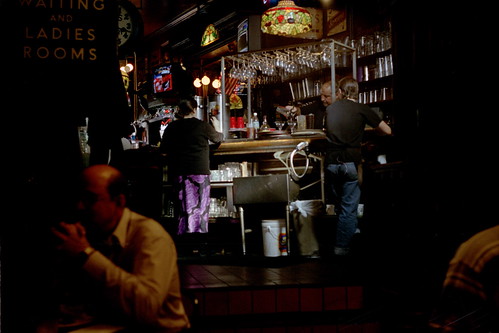
This isn't the first camera I've written about which I had only ever used once before - and some cameras to come will be used for the very first time. But the Miranda is calling me back already. This is from 2006, the only other time I used the Miranda:

available light
Hawk and Dove, Washington, DC. Kodak Gold 200.

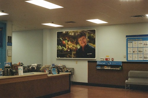
Last week I loaded the Miranda with a roll of mildly expired (2008, which is peanuts for me) Kodak Portra VC400. This is from the Wal-Mart in Front Royal, Virginia. The meter seemed to expose for the ceiling lights - I should have over-exposed slightly to compensate.

customer service

This picture of my nephew shows the problems I had focussing indoors.


Photographers will sometimes tell you to "zoom with your feet," meaning instead of having a mongo telephoto lens you just get closer to your subject when you can. With the Miranda, I found it helpful to focus with my forehead, leaning just a little bit closer until I saw my nephew coming into focus.Which appears to be what he's doing with the subject before him.


Thursday, May 19, 2011

every camera I own: the kodak pony 135

The Kodak Pony was originally manufactured in 1949 to take one of Kodak's proprietary formats, 828 film - the same width as 35mm film but in roll, not cartridge, form. (828 film also lacked sprockets. And now we don't dance.) I had assumed that the 35mm Pony was a replacement the 828, which was never a popular format, but the models were produced in tandem for much of the Pony's run - the 828 in production from 1949-1959, various 35mm models from 1950-1962. (source: Camerapedia). The 35mm models sold for only a few dollars more than the 828 model, and even adjusted for inflation the difference is no more than a portrait of Alexander Hamilton. Go figure. My Kodak Pony looks like the first or B model, but its lens is not collapsible, as the Camerapedia entry claims.

I got my Kodak Pony from a St. Augustine antiques shop, along with last week's featured Cub Scout Imperial Debonair, a gift from V. Maybe I'm just sentimental that way, but I've always thought the Cub Scout, a classic toy camera with classic toy camera limitations like no focus or aperture/shterr speed adjustments to speak of; took better pictures than the Pony, a bakelite camera that isn't exactly a toy: it has a 51mm Kodak Anaston lens that stops down to f4.5 and up to a neat f22, with shutter speeds from B to 200. The camera is not difficult to operate but it requires additional steps that I keep forgetting to take - like cocking the shutter, or pushing a little wind-level on the back of the camera every time I want to advance the frame. In the close-up of the lens, at approximately 3 o'clock you see the shuttercock in cocked position. I won't say that word anymore in this post. By which I mean position.

I think I've only ever run one roll of film through this camera before this year, and I don't remember any of those pictures being remarkable - I never uploaded any of them to Flickr. But perhaps my struggles iwth the controls (and lowish-res scans by Walgreen's), combined with mildly expired film, gave some images on this roll that bit of frisson I like in toy camera picatures.

63370003


It's an image I try to capture whenever I'm visiting family in Front Royal and we go to the local Cracker Barrel, which is across the street from this Target. (I wrote about a haunted Cracker Barrel in Naples, Florida, here.) I've always been struck by the iconic logo peeking out from the Shenandoah Valley. I have yet to take what I feel to be the definitive version of this bloodshot landscape (this picture, made with my Hasselblad, might come the closest to how I see it), but I'll keep trying, and not always from the back seat of a moving minivan.

every camera i own: the kodak pony 135
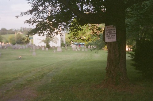
Cemetery next to Griffin Tavern, Winchester, VA.
Standing still, I still have issues with range focusing. This is one of the more in-focus shots from this roll, its sharpness aided by the fact that I did not mistakenly think I'd forgotten to cock the shutter and thus made a double-exposure from two stances not quite similar enough:


Practice will make better.

Tuesday, May 17, 2011

photobook review: James and Karla Murray, Store Front: The Disappearing Face of New York (Mini)

This turned out to be a rant more than a book review, but I do highly recommend the book. Article first published as Book Review: Store Front: The Disappearing Face of New York (Mini) by James and Karla Murray on Blogcritics.


Luncheonette, Brooklyn. 2005. Photo by James and Karla Murray.
A recent Village Voice piece under the category “My Rant” takes aim at the latest sign of what seems an irrevocable change in the demographic of the East Village: an Avenue B drinking establishment -cum-atrocity exhibition yclept billy Hurricane’s - note self-conscious lowercase name, as if self-deprecation is at all possible if followed by the red-hot pitchfork capital that announces the storm’s arrival. Blogs like EV Grieve and Jeremiah's Vanishing New York document this gentrification with nostalgia for old-school businesses and frequent disgust for the homogenization that continues to replace a vibrant commercial landscape. It’s a story that plays out again and again as people across the U.S. return to the city - but at what cost? Every city deserves a project like James and Karla Murray's landmark Store Front: The Disappearing Face of New York.

Store Front was originally released in 2008 as a massive coffee table book. Gingko press has now released a mini version, handsomely bound but easily carried around in your backpack as you take it around the city and gnash your teeth at what used to be. Even in 2008, a third of the storefronts documented in the Murray's survey were gone. At this date who knows how many are left? For every Strand Books, whose proprietors own the building that has housed one of the world's great bookstores for over fifty years, there are a dozen 12th Street Books, which left the shadow of the Strand for what it hoped were greener pastures in Brooklyn; renamed Atlantic Books, they shuttered their doors just last week.

The Murrays, who have also photographed the even more ephemeral work of graffiti artists in New York and Miami, began the Store Front project in 2001. 35mm camera and audio recorder in hand, they documented not only the public face of disappearing New York but record owners’ stories for posterity. The bold and sometimes eccentric typography, often hand-painted; the butcher shops with smoked meats hanging in the window (which were the reason the Murray's neighborhood butcher had to close); these are more welcoming than another goddamned froyo or cupcake shop. Will future blogs, or whatever the medium is when we are all permanently wired to the grid, lament the lost Starbucks and CVS's of the past?

I recently reviewed two films that also, in very different ways, look at the lost metropolis: 80 Blocks from Tiffany's, a document of the South Bronx in the midst of it's bombed-out late 1970s devastation; and The Last New Yorker, a contemporary look at the changing city that does nobody any favors by creating for its mouthpiece a patronizingly written, befuddled old man. You don't have to be a geezer to lament the passage of time. If you are at all interested in what's happening to New York or any urban landscape, pick up Store Front, and a Gem Spa egg cream, while you can.

Friday, May 13, 2011

every camera I own: the cub scout imperial debonair

cub scout imperial debonair
A gift from V.
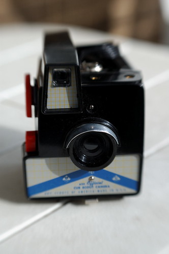
The Herbert George Company was a Chicago camera manufacturer named for founders Herbert Weil and George Israel. The mainstay of their bakelite camera fleet was the Imperial, a brand that was launched in the 1940s and lasted through a change in ownership in 1961, which is about when the Cub Scout Imperial Debonair was born. You can see the Imperial Debonair, sans Cub Scout branding, here, and an older Girl Scout version here. The keen machine you see here was a gift from V. in a St. Augustine antique store, where I also got a Kodak Pony 135 I'll write about soon.

The Cub Scout Imperial Debonair has the best name of any camera in my collection, and is one of the sharper toy cameras I have, and has a wider-angle lens than most toy cameras. It uses 620 film, and unlike the Brownie Hawkeye Flash its spool wells do not have the tolerance to allow for snipped-down rolls of 120. So I've had to make do with expired film or the re-spooled rolls that B&H used to sell. This shot, scanned from a print,  was made in 2007 with expired Kodacolor II:


scout sheridan


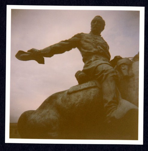
The statue depicts General William Sheridan, a Union General in the Civil War. He sits in the middle of a traffic circle named for him, along a stretch of Washington's Embassy Row on Massachusetts Avenue. Facing the circle is what was once the residence of the Philippine Embassy, where my father worked when I was a child. On September 21, 1976, a Chiliean foreign minster (under Salvador Allende) was driving around Sheridan Circle with a female assistant and her husband of four months.   A plastic car bomb exploded, killing Orlando Letelier and his assistant Ronni Moffitt. Moffit's husband Michael managed to crawl out of the back of the car, and escape with a head wound.

The film I used to make the picture of the Sheridan memorial expired in 1981. A commemorative plaque to Letelier and Moffitt also lies on Sheridan Circle.

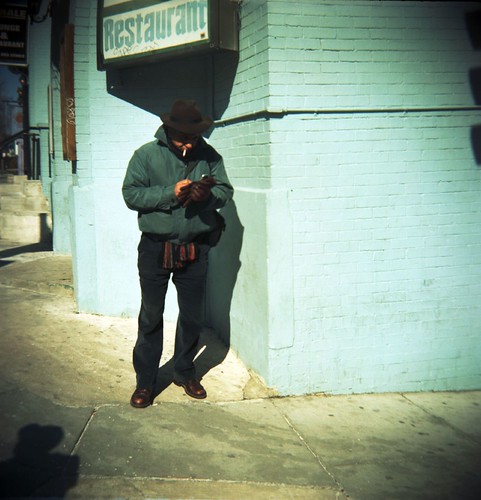
restaurant
18th Street, Washington, DC, 2007. Kodak 160vc
I made one of my most popular toy camera pictures with the Cub Scout Imperial Debonair. I used its inaccurate viewfinder as a feature, not a bug. This was selcted for DCist Exposed 2009, and is also reproduced in the DCist Exposed magazine, available here.

take a bite out of composition
"Take a bite out of composition." The National Mall, Washington, DC, 2009. Tri-X.

Last week, for my Every Camera I Own project, I opened up a roll of Verichrome Pan 620 that supposedly expired in 1982 - an eBay purchase from who knows when. The box seemed to be sealed but the start-end of the backing paper was scotch-taped to the spool, and didn't have the usual Kodak label. Mid-way through the roll, the frame numbers o nthe backing paper stopped appearing - the lab guy later told me that the backing paper was folded over mid-way through the roll. I had a bum roll, and only three or four images had anything on it at all. Fogged film has been my friend lately. (Addendum: apparently I used film from this same expired batch before, with similar results.

Dupont Circle.

Happy Friday the Thirteenth:

Fletcher's Boathouse, from the same pov as this.

Sunday, May 08, 2011

photobook review: in almost every picture #2

Article first published as Book Review: In Almost Every Picture #2 by Erik Kessels, Tyler Whisnand, Andrea Stultiens, and Anonymous on Blogcritics.

Collections of found photography - the kind of things you find in flea markets - come along more often than the 42 bus. The angles are various - some are sociological, some merely camp, some aspire to art. The finest purveyor of the last is Erik Kessels, the Dutch publisher who created successful series of vernacular photos like In Almost Every Picture and Useful Photography, as well as one-offs like Photocubes, which as its title says simply reproduces the stock images included in photocube frames.

In Almost Every Picture is now in its ninth volume. The most recent is a collection of failed attempts to photograph a black dog that, owing to exposure difficulties, appears as an amorphous, unidentifiable blob, sometimes with eyes. The appeal of that volume is broader, but under the magnifying glass this Mother’s Day is a more subtle iteration of the series, more indicative of the mundanity faced by the amateur photographer, who nevertheless makes art by dint of sheer persistence (and a remarkable editor).

In Almost Every Picture #2 collects a few hundred photos made by a Dutch taxi driver who took his passenger through various tourist destinations in and around the Alps. But these are not your standard postcard views of picturesque scenery. The driver took a photo of his physically disabled passenger in his taxi at every stop they made: parking lots, rest stops, sunsets, overlooks, congested roads. The majestic Alps, and sometimes less majestic power lines, tower over the taxi. Kilometer markings are indicated across from most photos - one image demonstrates that the driver frequently photographed the dashboard to commemorate the distance travelled. But save for two explicatory images (a second dashboard photos shows that it was too dark to take an odomoter reading), the rest of the book documents a long and strange affection, a road trip cum business relationship cum personal relationship. The driver and his passenger have their travels over a number of years - during which time the driver gets new plates for his Mercedes cab. The photos are not particularly well composed; the passenger lies there usually inert and sometimes is difficult to see at all. Some photos, like the cover shot, are taken from a distance where the taxi is barely visible through foliage; these come off as surveillance shots, and are chilling. But the persistence in documenting this tenuous tourism year after year is touching; and when the tables are turned and you see the last image (SPOILER ALERT!) of the young taxi driver; one wonders: was that his mother? Perhaps not, but this book of mundane vacations photos is more evocative than at first glance.

Friday, May 06, 2011

every camera I own: the holga 120N

The Holga, along with its overpriced Lomographical-branded compatriots, is the toy camera that brought back the toy camera at the turn of the twenty-first century. I've owned two of them at a combined cost (even including the modified holga, pictured) of less than what the Lomography Holga starter kit will set you back at Urban Outfitters. But at any price, it's a keen camera, and, for a plastic camera, pretty sturdy. I remember reading a heated discussion in a Flickr toy camera group where one reader accused another of some kind of elitism for suggesting that the build quality of the "new" Diana cameras (replicas and variations of a cheap and cheaply made model that was mass produced in the 60's) paled to the build quality of the less retro-minded Holga. But c'mon. I wouldn't think of carrying my Diana replica around without at least one layer of padding around it, but I'd throw my Holga into an unpadded bag and feel confident it won't fall apart in transit. I've broken two Diana's in my time, one (an original 60's model) before I even fed a single roll through it, and another (the Diana Mini, whose design is based on the 120-film model but uses 35mm film) after gingerly advancing one roll of film through it's tender maw. I   have yet to break a Holga of any variety, even after dropping one in the Jewish section of a Key West Cemetery; the back fell off unexpectedly  - this was an unmodified, and poorly secured, model - but the parts remained intact.

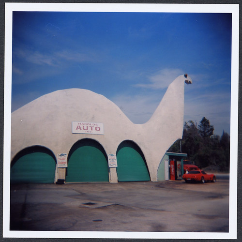
Anyway, the Holga is not a sharp photographic machine, but the toy camera aesthetic is not about sharpness. It's hip, but it's a "square" format. Hee. The modified Holga pictured above has velcro straps to keep the back secure, and foam padding to let the film sit more firmly in the camera (my unmodified Holga required a little piece of folded up cardboard to keep the feed spool taut).  I don't remember when I got my modified Holga - I never tagged them as one or the other - but I have a feeling I took better pictures with the leakier, less reliable, if fairly unbreakable original. I made this picture in Spring Hill, Florida, nearby Weeki Wachee, with my first Holga:

harold's auto


One problem I've had with the modded Holga more than with the original Holga - and there's no reason why this should be, it just happened that way - is that I forget to set the shutter to N for normal shutter speed, which is some fraction of a second. On at least a couple of occasions I've shot the better part of a roll of film before realizing that I was shooting at B, or the bulb setting, meaning I was probably leaving the shutter open and unsteady for most of a full second. So what should have been an image as reasonably "sharp," by plastic camera standards, as the above, I end up with something like this:


I was halfway through the roll before I saw I was shooting on "B." But to finish the roll I shot several exposures with a cheap Holga flash (made cheaper at one of Urban Outfitters occasional clearance sales where they sell off Lomography accessories at a reasonable price.


This is Mmrma, the jawless ventriloquist dummy that I spied on eBay and inspired some of my better Nanowrimo passages - well really he threw the whole project into a different and better direction. This blog will occasionally get hits from Middle Eastern nations from people googling something like "mmrmst sex" - I can't replicate the search at the moment but the search, which I've never been able to figure out (some transliteration?) has led several unsuspecting gooblers to my Nanowrimo blog posts. Mmrma is laying on a swath of three yards of red velour which I frequently use for a photographic background, and is posing with the Hernard Title Letters I've been using in my photos almost every day for the past several weeks.


Wednesday, May 04, 2011

kittens inspired by angst


With mad props to the late Admiral Stockdale. See more of my work with Hernard Title Letters here.

Sunday, May 01, 2011

photobook review: Capitolio, by Christopher Anderson

I suggested a photobook feature to Blogcritics and hope to get that happening soon. It will collect the photobook reviews I've been writing for them - my count is now thirteen! - in one place. Anyway, as befits my review of an iPad photobook, I composed a draft of my review on my new iPad 2, which. Keying 500 words on a tablet was not a difficult ordeal, but I fine-tuned and formatted things on my laptop. Article first published as Book Review: Capitolio by Christopher Anderson on Blogcritics.

Christopher Anderson's Capitolio is the first photobook designed sepcifically for iPad and iPhone. So before I address the work, a word about the format. Does the portable screen enhance or diminish the photographic experience? Is the full potential of the digital format used?

I was a reluctant convert to digital cameras from the analogue world of photography, and to this day I regularly tweet at my local repertory movie house to make sure they're showing a 35mm print. Physical film is important to me. Digital formats may not suit most photobooks - to think of one fairly recent example, the photobook I reviewed last week, Jason Fulford’s Raising Frogs for $$, makes the most *sense* as a strikingly bound physical object.

But the body of work in Capitolio is well represented by its digital format. Originally produced in a print edition in 2009, it’s a striking app laid out in wide-screen format, and the swiping navigation is sympathetic to the photographer's intention that these photos make up a particular cinematic sequence. The stark, high contrast black and white images may not be what one would expect from the first iPad photobook, but the chosen tonal palette is somewhat limited by design, and thus lends itself well to digital reproduction. (Daido Moriyama’s grainy, hi-contrast iamges would work well in this format; less so the more subtle tones of a Eugene Atget, a catalog of whose works is avalaible as an eBook (page layouts straight from the print edition, so not designed specifically for tablet) from the Moma Books app.)

Anyway, what of the work? Anderson shot this project in Caracas, Venezuela, in the shadow of a specific domed building or Capitolio, but he sees Caracas as a metaphorical Capitolio, a means of examining the nature of power, its cause and effect, modern architecture juxtaposed with poverty: something is rotten in the Capitolio. Anderson was given audience with Venezuela’s Socialist leader Hugo Chavez on numerous occasions, but the photographer insists that this is not primarily a political work, or what we ordinarily think of as photojournalism. Politics does pervade these images, but rather than declare rights or wrongs, the artist immerses himself to convey something of the experience of being there - a documentary made by a poet.

iPad features include a Director's Cut section, which offers larger versions of images sized to fit the widescreen format of the “book” layout; and a link to buy the printed book on Amazon. In a bonus video interview, Anderson recounts the danger he was in while he worked in Caracas, culminating in the photographer having a gun pointed at his head, which threw him into a harrowing ordeal all in the name of political theater. The interview has an added poignancy: it was conducted by Anderson’s friend and fellow photographer Tim Hetherington, co-rdirector of the Afghanistan War documentary Restrepo. On April 20, 2011, Hetherington was killed while covering the crisis in Libya. These are the new generation of photographers who take their vision and their lives to the front lines. Anderson’s work is black and white, but it is the grey area, the moral and political ambiguity that makes this body of work sing of an uncertain world.


Download Capitiolio for iPad/iPhone app here.