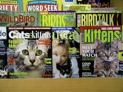
he descended into hell:
Originally uploaded by a nameless yeast.
What began for me as playful curiosity - how to photograph men having sex with 125 lbs. of a perfectly formed synthetic female - rapidly turned into a serious exploration of the emotional ties that exist between men and women and their dolls. This exploration forced me to evaluate my own notions of love and what it means to value an object - a replacement human being, in effect - as real.
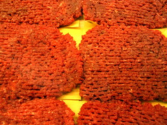
listen to meat:
memo from turner on diddy wah
unreleasesd M.I.A.
chanteuse babylon at blow up doll
via zombizi

The award-winning SHOWstudio website was launched in November 2000 by photographer Nick Knight as an online space for leading creatives to make experimental, personal work engaging with the new fields of motion image and interactivity. In its first three years, SHOWstudio has developed into a high-profile fashion broadcasting initiative with over 200 contributors including Kate Moss, Hussein Chalayan, Alexander McQueen, Björk, Julie Verhoeven and Yohji Yamamotodig into the film section for work by guy bourdin
The teenage dance show American Bandstand was, circa 1980, entirely innocent of such things, with a history beginning with the likes of Frankie Avalon and extending to the mild end of '70s pop-rock. PiL's booking there revealed a latent fiendish streak in host Dick Clark. The band mimed to the bleak soundscapes of 'Poptones' and 'Careering,' from Metal Box, with Lydon haranguing the cameramen and making no effort to conceal that he was lip-synching. The studio audience made a valiant, but futile attempt to dance and stay in character, ruined by Lydon's good-humored incitements to storm the stage. General chaos broke out, and the show ended with the audience dancing with band members, band members goofing on their instruments, and Lydon chatting with fans while 'Careering' blared on. Clark, in later years, would refer to the appearance as 'One of the ten best American Bandstand episodes of all time.'
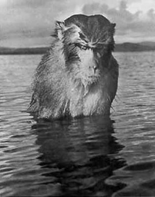
HANSEL MIETH: VAGABOND PHOTOGRAPHER is the compelling tale of a pioneering woman photojournalist who created some of the most indelible images of America mid-20th century, but is in danger of being forgotten today. A German immigrant who arrived in this country in the midst of the Great Depression, she rose to become a celebrated LIFE magazine staff photographer, only the second woman to occupy that position. Armed with convictions, perseverance, and talent, Mieth courageously carved out a career in the male-dominated world of photojournalism at a time when very few women were accepted in the profession.
eBay is a labyrinth of search words, doors, and links; it gives the opportunity for each and every participant to leave their mark, whether by bidding, listing or asking questions. With these thoughts, I realized I had started to weave a web in my little corner of eBay. I thus began to list items that would appeal not only to my friends, but also to strangers. It was to be an experiment in finding participants, perhaps collaborators, in projects which I would conceive.
My first such project was to wear an ugly shirt for 7 days starting at $.99...
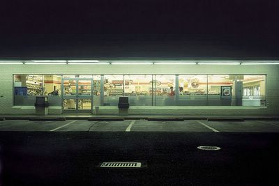
This project on the convenience store is concerned with the consumer culture of immediacy, 24-hour availability, information overload, and the loss of local identity. The images were made after midnight and photographed with a 4"x5" view camera in a straight-on objective style. I was influenced in equal parts by the German photographic team of Bernd and Hilla Becher’s straight shoots of industrial landscapes and Ed Ruscha’s 1963 book Twenty Six Gasoline Stations.via conscientious
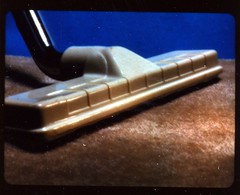
from the filmstrip WHAT EVERYONE SHOULD KNOW ABOUT FABRICS PART I
Shouldn't pop artist Ed Ruscha be getting some credit for A9's new block-view feature in its yellow pages. Four decades ago, Ruscha mounted a motor-driven 35mm camera on a car and drove up and down Sunset Boulevard in Los Angeles making the photographs that became his 1966 book Every Building on the Sunset Strip. The accordion-fold book was a literal, deadpan rendering of, well, every building on the Sunset Strip.via things.
Now the folks at A9 have mounted digital cameras and GPS units on SUVs to photograph every commercial building in ten cities (so far), including Los Angeles.
Kevin Matthews is a Chicago radio personality who has exhorted his fans -- the KevHeads -- to yell 'Freebird' for years, and claims to have originated the tradition in the late 1980s, when he says he hit upon it as a way to torment Florence Henderson of 'Brady Bunch' fame, who was giving a concert.via tuning
''Petra Haden Sings: The Who Sell Out." The title is mind-bogglingly accurate; this is a homemade one-woman a capella re-creation of the Who's 1967 album. Haden, the daughter of jazz bassist Charlie Haden, sings every word, every drum roll, every guitar solo, and every mock commercial, note for note, front to back.
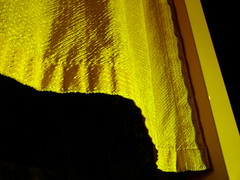
The gates added a layer of visual intrigue to the already pleasant view of a snow-covered Central Park at night. The best place I found to look at the gates was at the zoo entrance - the light was strong and wind ruffled the curtains. They're alright.
At the Whitney. Tim Hawkinson is a sculptor. A few years ago I saw his Uberorgan, a huge biological model gone mad constructed from parachute material and pipes that sprawled through a maze of rooms and made foghorn sounds controlled by a kind of player-piano type "computer" base. That was in a Tribeca gallery, but for this retrospective the Uberorgan is on view at the Whitney's sculpture garden.
A huge aluminum-foil hanging is cut and contoured to look like an elephant skin. A ten-foot square panel looked like a pane of shattered glass, but the patterns were made of what must have been miles of silver mylar tape arranged to look like broken glass. He can work on a smaller scale too. A tiny sculpture of a pterodactyl is one of a series made from fingernail clippings. The guy has *lots* of time on his hands (and/or patient hired assistants). I have to admire somebody who can make something constructive out of OCD.
I just didn't get Cy Twombly. There's abstraction that seems chaotic or simple but is really quite beautiful and technically accomplished - Pollock, say, looks like a mess but his stuff is so dense and dynamic. Twombly's drawings really do look like a kid's random crayon scrawlings. Really. A friend and I took a first pass through those galleries, but on our way out a tour guide was leading a group through the show and we went through again, just to hear what the hell this guy was about. He's anti-technique, anti-composition (how?!) His graffiti-like "chalkboard" paintings are about the "contamination of space," an idea I can get with. He uses bright colors to seduce - at least that's what the guide and a sympathetic fellow in the tour group said, but I think he uses the tools of seduction - splashes and streaks of color, especially a deep slutty red - to turn you off. It's like a woman applying makeup really, really badly, not just too much but in places where it doesn't belong.
Twombly's recent paintings work more like "conventional" abstract impressionism, with bright and pretty colors applied in an abstractly appealing fashion. I guess these are more seductive, but I found them less interesting - his work was more intriguing when it tried to push you away. But I'm weird like that.