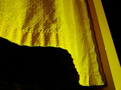
the gates
Originally uploaded by a nameless yeast.
The gates added a layer of visual intrigue to the already pleasant view of a snow-covered Central Park at night. The best place I found to look at the gates was at the zoo entrance - the light was strong and wind ruffled the curtains. They're alright.
At the Whitney. Tim Hawkinson is a sculptor. A few years ago I saw his Uberorgan, a huge biological model gone mad constructed from parachute material and pipes that sprawled through a maze of rooms and made foghorn sounds controlled by a kind of player-piano type "computer" base. That was in a Tribeca gallery, but for this retrospective the Uberorgan is on view at the Whitney's sculpture garden.
A huge aluminum-foil hanging is cut and contoured to look like an elephant skin. A ten-foot square panel looked like a pane of shattered glass, but the patterns were made of what must have been miles of silver mylar tape arranged to look like broken glass. He can work on a smaller scale too. A tiny sculpture of a pterodactyl is one of a series made from fingernail clippings. The guy has *lots* of time on his hands (and/or patient hired assistants). I have to admire somebody who can make something constructive out of OCD.
I just didn't get Cy Twombly. There's abstraction that seems chaotic or simple but is really quite beautiful and technically accomplished - Pollock, say, looks like a mess but his stuff is so dense and dynamic. Twombly's drawings really do look like a kid's random crayon scrawlings. Really. A friend and I took a first pass through those galleries, but on our way out a tour guide was leading a group through the show and we went through again, just to hear what the hell this guy was about. He's anti-technique, anti-composition (how?!) His graffiti-like "chalkboard" paintings are about the "contamination of space," an idea I can get with. He uses bright colors to seduce - at least that's what the guide and a sympathetic fellow in the tour group said, but I think he uses the tools of seduction - splashes and streaks of color, especially a deep slutty red - to turn you off. It's like a woman applying makeup really, really badly, not just too much but in places where it doesn't belong.
Twombly's recent paintings work more like "conventional" abstract impressionism, with bright and pretty colors applied in an abstractly appealing fashion. I guess these are more seductive, but I found them less interesting - his work was more intriguing when it tried to push you away. But I'm weird like that.
No comments:
Post a Comment