Tuesday, November 01, 2011

patricio is moving

To Wordpress, home of more elegant templates and The Honcho. Content will stay here for a while but it's there and unpacked at the new place. New content coming soon.


Update: I changed my address to patpadua.wordpress.com

Monday, October 17, 2011

recent writing

every camera I own and the photobook review will return shortly. Meanwhile my writing for other venues continues apace.

DCist: Out of Frame: Gainsbourg: A Heroic Life


Can a graphic novel successfully make the transition to a live action feature film? The attempts have varied wildly from sources both independent (Terry Zwigoff’s spot-on adpatation of Dan Clowes’ Ghost World) to blockbuster (Zach Snyder’s muddled vision of Alan Moore’s Watchmen). Comic artist Joann Sfar bypassed the usual artistic differences by adapting his own graphic novel based on the life of an iconic and controversial French singer. The resulting film, Gainsbourg: A Heroic Life, straddles the fence between graphic novel invention and cinematic convention. Its cinematic successes and graphic novel excesses make me wish it had taken the real life plunge and left the comic art world alone.
Read the rest of the review here

--

DCist: Out of Frame: 50/50

A lot of virtual ink and chatter has been spilled and offered about 50/50, directed by Jonathan Levine. The script by Seth Rogen’s longtime buddy Will Reiser is based on Reiser’s own cancer scare at the age of 24. The film is already being met with almost universal accolades that it Gets Cancer Right. 50/50 has a well-meaning script that gets a lot of the details right: of hospital life, of sickness and dying. But it’s so wrapped up in Hollywood convention that not even Seth Rogen, try as he might, can lift this out of the Lifetime Movie for Hipsters aisle.

Read the rest of my review here.

--

DCist: my review of Thunder Soul from Popcorn & Candy: The Funky Passage of Time Edition


Thunder Soul
What it is: The inspiring story of an unlikely funk success.
Why you want to see it: Director Mark Landsman hits one out of the park with his feature-length documentary debut. Thunder Souldocuments the history and reunion of a legendary 1970s funk band that happened to be made of high school students. At the end of the 1960s, band director Conrad O. Johnson took charge of the music department of Kashmere High, an all-black school in Houston, Texas. He instilled his students with a sense of dignity, discipline and showmanship, and with his own stirring original compositions and arrangements he turned the Kashmere Stage Band into an international success. The stage band scene grew out of the big bands but with a pop bent -- think early Chicago or "Spinning Wheel" played in velvet suits. The bands were typically very square and very white, but Johnson proved that expert musicianship, both professional and soulful, could be achieved by inner-city kids -- and that they could blow away the competition. The film is told in vintage footage and photographs of the band along with contemporary interviews, as well as a look at the rehearsal process of the band's reunion for their 92-year-old prof.
You may have never heard of the Kashmere Stage Band, but the film opens with a sound clip that may sound familiar. It's DJ Shadow, working with Handsome Boy Modeling School. Josh Davis (a.k.a. DJ Shadow) appears late in the film to explain that when he found that drum break (from the funky theme song Johnson wrote for Kashmere High) he had no idea he was listening to a student band. A hipper director might have taken the DJ Shadow angle and framed the entire story around it, but thank your documentary stars that Landsman focuses on Kashmere itself and treats the rediscovery of the music as a sidebar. It is an important sidebar, as the music reached an audience far beyond the Houston community that spawned it. Interviews with record label owner/"funk musicologist" Eothan Alapatt tell the story of rediscovery, as he tracks down the albums in thrift shops and is eventually introduced to Conrad O. Johnson and his treasure trove of master tapes. A CD compilation of the Kashmere Stage Band's music band was, as Alapatt put it, popular with "middle-aged white people." It climbed as high as number 3 on the Amazon charts, and if Thunder Soul has the legs it deserves, their numbers will be going up again. The reunited band is available for gigs, although many of the reuniting band members had not picked up their instruments in more than thirty years. You hear those missing years in the early rehearsals. But then the voices come together again in unity and all is fight and funky with the world. (Note: I could insert an Amazon link to the CD, but ask your local independent record store -- if Melody Records doesn't have it in stock, I bet they can get it).
View the trailer.
Still playing at E Street and the AFI Silver.
Other recent writing:
For In The Muse: 
For DCist:

Thursday, October 06, 2011

every camera i own: the werramat

I first read about the ingeniously designed Werra on this blog post about an amazing Japanese camera shop that specializes in old lenses - the propietor's cutoff date is 1974, but the emphasis seems to be on the 1930s.

The various Werras were manufactured by the legnedary Carl Zeiss plant in Germany, and was named after a German river. I'm not sure what the visual metaphor is from river to camera, but if the Werra flows it is in its design. Even from the limited vantage point of the camera-with-a-kitty photo at right you can immediately see what makes the Werras stand out: the shutter release is the only control on top of the camera.

In the Werra series of cameras, the shutter cock, the film advance, aperture and shutter speed settings are all contained within the lens barrel. Aperture and shutter speed are not unheard of functions for a lens barrel, but the Werra takes it further. A simple clockwise twist of the black ring you see at the base of the lens both cocks the shutter and advances the frame.

Being manufactured by the great Zeiss factory, the lens is pretty sweet, though zone focusing is still not my forte.

88870007
Across the street from Ford's Theatre.
But this close-focus shot worked out.

88870017
Ann Taylor Window, some Lomo branded 200 ASA stock.

88870008
Connecticut Avenue

88870005
RIP Arch West.

Monday, September 26, 2011

O Captor My Captor! DVD Review: Sweet Hostage

Article first published as DVD Review: Sweet Hostage on Blogcritics.

In this age of the 24-hour news cycle, we take it for granted that producers of reality television and made-for-cable movies will respond quickly to this morning’s headlines. Such was the case even in 1975, when the fondly remembered Sweet Hostage was featured as ABC’s Friday Night Movie. Today’s audiences may appreciate it for melodrama and even a little camp factor, but they may not be aware of the timeliness of the plot.

Martin Sheen plays Leonard Hatch , a mental patient who as the film opens is reciting Coleridge’s Kubla Khan, right before he escapes from a Boston asylum through a laundry chute. Linda Blair is seventeen-year old Doris Mae Winters, a farmer’s daughter who is wielding a gun when we first see her: she’s just shot a 6-foot rattlesnake and hopes to keep it as a trophy when her hysterical mother (a staple of the 1970s teenage movie - cf The Loneliest Runner) comes along and axes it to pieces. These efficient opening scenes are an overture to the movie’s themes: the ennobling nature of literature; escape from the confines of societal expectations; man vs. nature; sexual hysteria. The characters' names are ripe with meaning as well - Hatch opens up an escape route not simply for himself; Winters is clearly discontent in her life on the farm. It is also obvious that she can fend for herself. However, the only trophy she manages to salvage from her kill is the snake's rattle, which various characters treat as a talisman throughout the film.

This is a pair fated to meet, and when Sheen, on his third or fourth hot car, ends up in New Mexico, he chances upon Blair examining her broken pick-up truck. Their fate is sealed and Sheen takes her hostage in a remote cabin.

Stocklholm Syndrome  is the phenomenon where a hostage develops sympathy for their captor. Classified in 1973, its most famous example was the 1974 case of Patty Hearst and her abduction by and later affinity with the Symbionese Liberation Army. When Sweet Hostage was first broadcast, the notion of a hostage falling for their captor was very much in the news. Today it would seem sick if not entirely surprising that a major network would respond to the headlines with what is essentially a romance.

Sheen and Blair have an easy chemistry, so much so that despite her protestations, you never quite fear for her life. Sheen’s star-making turn in Badlands in 1973 also prepared us for a sympathetic depiction of his outlaw urges; and Blair's battle with the devil established her own strength.

Despite the captor's aggression, his intentions seem chaste, even professorial. The literary conceits that Sheen wields are hammier than we have come to expect from him, and we can probably blame a lot of erudite-insane characters on this performance (hello The A Team?). Hatch/Sheen takes to calling his hostage Christabel, after another Coleridge poem. Winters resists her captor’s didactic approaches at first but this becomes part of an enriching teacher-pupil dynamic.

The sympathy between captor and hsotage may be unusual and even distasteful but the actors play it well, especially when the script reins in the literary references that often lean this in the direction of camp. The script by Edward Hume (who went on to script the apocalyptic tv-movie The Day After) can be overheated and the symbolism heavy, with a serpent and an apple signifying Eden. Scenes in the cabin become a haven away from the townspeople, who seem to belong to a different tribe. The cabin itself is like a stage, Sheen and Blair players in a chamber piece reluctantly pulled away from to get provisions - and this is where the Fall begins. They don’t make them like this anymore, and that may be a good thing, but those who like their backwoods romances uncomfortable will love Sweet Hostage.


Like other Warner Archives made-to-order DVDs, the disc does not include any bonus features. You can pre-order it from Amazon, but it's cheaper if you order directy from Warner Archives, where it is available now.

Friday, September 23, 2011

a picture is worth 3000+ words: this week in movie and art reviews

(e)merge arf fair
Detail from Patrick McDonough's Doghouse at (e)merge art fair, Capitol Skyline Hotel. Photo by Pat Padua

I've written that much this week despite a summer cold that's been lingering since early August. My by-lines for other outlets this week:

In the Muse
DCist
I'm ready to pass out now.

Monday, September 19, 2011

photobook review: 26° 81°: photographs of immokalee, florida, by joshua dudley greer

Article first published as Book Review: 26° 81°, by Joshua Dudley Greer on Blogcritics.

Palm trees; orange groves; flamingo-pink houses. These are the kinds of images that the State of Florida brings to mind, and these are an integral part of 26° 81°,  Joshua Dudley Greer’s collection of large-format photos. But Greer goes deeper than that in his study of the town of Immokalee: to the trailer park, the migrant worker, the anonymous apartment buildings. In my own trips to Central and South Florida I have found a lot of poetry beyond the Mouse and his kin, in the scruffy commerce of small towns like Webster and Brooksville. Greer finds that and more in the people of Immokalee.

Immokalee, fifty miles west of Naples in Southwest Florida, was struck by Hurricane Wilma in 2005, which makes the town an apt stand-in for the struggle and resilience of the natives and immigrants who try to make a living there. Greer’s portraits are sensitive and dignified: of the dowager who is the last surviving daughter of the original settlers of the town, to the middle-aged African-American Reverend, to the young woman celebrating her QuinceaƱera.

26° 81° is an admirable project with its heart in the right place - half the proceeds of the book go to the Immokalee Foundation, a non-profit that “provides educational tools, opportunities, and encouragement to the children of Immokalee, Florida.” If strong photos and honorable intentions were all that made a successful photobook, then Greer’s monograph would easily pass the audition. But the old saw that you can’t judge a book by it’s cover does not apply if the cover works against the contents, and this is where the book falls short of something more. The handsome binding is wrapped a banal jacket that depicts a powder blue map of the area; perhaps it was the book’s publisher, Joseph Dednik, (credited as “chairman of Prescient Ridge Management”) who saw fit to make the book look like a company report, its title reducing the humanity of the photographs to points on a graph.

Why not just call it “Immokalee?” Geography can be a potent metaphor - it may not be fair to compare this to of Alec Soth’s great Sleeping by the Mississippi, but the use of large-format cameras in a geographically themed project sort of begs the comparison. Where that book’s title concept and cover enriched the work, the framing device here seems made to seduce the policy wonk more than the general photography consumer. I learned about the book from a photography blog that showcased Greer's photography. Had I seen it on the table at Dashwood Books, I may never have opened it. Perhaps the marriage of aesthetic and statiscial concerns describes where the town Immokalee, and the nation, has failed its citizens. Unfortunately, the book’s design does no favors for the strong work inside.

Saturday, September 17, 2011

movie review: black zoo

I've been sick lately and may have been too hard on this. It's not a good movie but if it's sounds like fun to you, you'll probably like it. Just keep a finger on the fast-forward button. Article first published as DVD Review: Black Zoo on Blogcritics.

Who is the most dangerous animal? Lion? Tiger? Robert Gordon’s 1963 thriller Black Zoo suggests the answer is man. The complicated relationship between man and beast is the stuff of philosophy as well as the B-movie, and Black Zoo, which also goes by the clarifying title Horrors of the Black Zoo, addresses this time-honored theme with murderous beasts indeed. But simply adding “horrors” to the marquee does not alchemically create an effective cinematic scream fest. Vivid cinematography and elegant composition can’t save producer Herman Cohen’s lousy script. But the film is not without its moments.

Cohen is known for B-movies that don’t quite live up to their premise, like the early Michael Landon picture I Was Teenage Werewolf and the late-career Joan Crawford vehicle Trog. The burden of this dark menagerie is carried by Michael Gough, who starred in two other Cohen productions, Horrors of the Black Museum and Konga. For Black Zoo he takes on the role of organ-playing zoo keeper Michael Conrad, who lords over the animals of his Los Angeles zoo. James Dean wannabe Rod Lauren plays the mute Carl, the zoo keeper's charge, and veteran character actor Elisha Cook plays to his signature bug-eyed strength as he teases a tiger with raw meat. Add to this a memorable gorilla attack that prefigures Chinatown, and the synopsis alone may lure the unsuspecting viewer to pounce.
Sadly,  a few strong elements do not a well-balanced meal make. The script is stiff, heavy on exposition and light on propulsion, so the handful of startling scenes just lay floating in a pool of mediocre muck. Which is too bad - for a B-movie, the production values are good, the set design and cinematography suitably atmospheric.

Like other Warner Archives made-to-order DVDs, the disc does not include any bonus features, but it’s a new and crisp transfer from a good print. As a document of early sixties fashions and mores, the student of anthropology will find something to chew on in Black Zoo.
But horror aficionados will have to look elsewhere in the Warner Archives catalog for a more fulfilling meal.

Available only from Warner Archives.

Friday, September 16, 2011

every camera I own: a tale of two hassys


I used to think I'd never own a Hasselblad. The combination of cost and technique seemed forbidding and out of reach. But it wasn't too long after I started revisiting photography in earnest that I had the opportunity to buy a vintage Hasselblad 500CM, with a snazzy finder, at a good price.
my sassy hassy
December 2005.

It's the best camera I've ever had, maybe even better than the 503CW I switched it out with about a year later. Just looking through the viewfinder and the Hasselblad glass was a pleasure.

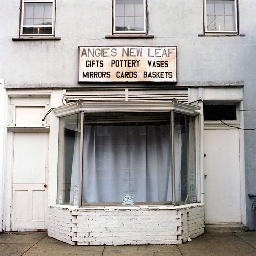
angie's new leaf
January 2006. From the first roll I shot with my first Hassy.


 I've made some of my best photos with it, including the shot that makes up the background image of this blog.

St. Augustine, 2007
With it's "normal" 80mm lens, it's also an excellent portrait setup.


tosca zoppe
Tosca Zoppe, Little Italy, New York, 2006


neighbor
Bill, Portland, Oregon, 2006

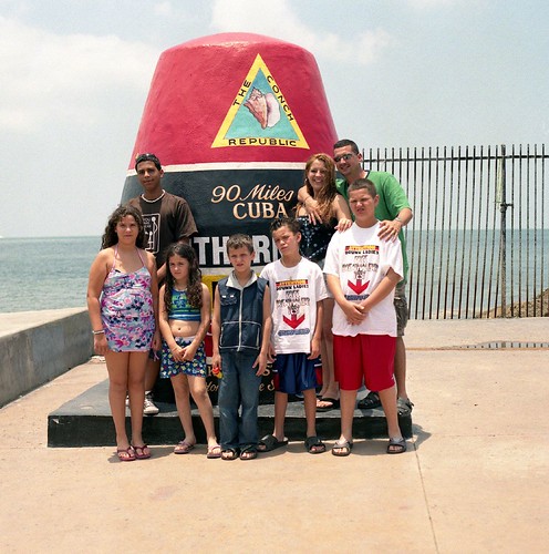
the lowest point in america
The Lowest Point in America, Key West, 2006.  I had no idea what I had when I made the shot, but look at the large view here


I took the Hassy 503CW back to Florida last month.

164047-R2-E020


76540001


76540003

Tuesday, September 13, 2011

photodvd review: Bill Cunningham New York

Article first published as DVD Review: Bill Cunningham New York on Blogcritics.

Bill Cunningham New York, the impressive feature debut from director Richard Press, may well be the best documentary ever made about a  photographer. That the photographer documents New York, for the New York Times Style section and other outlets, makes this  one of the great films about New York, all the more important as it captures a dying world. Cunningham was one of the last holdouts in the artists’ apartments above Carnegie Hall, whose legendary tenants over the years included Marlon Brando and Leonard Bernstein. This scene was further documented in the documentary Lost Bohemia, but BCNY gives the viewer a wistful glance at the corporate carnage at work all over the city: the wide open sapce that was once dance studio of Agnes DeMille (choreographer of Oklahoma and other milestones of American Musical Theater) has been recently broken up into telemarketer’s cubicles.


“If you can’t take money, they can’t tell you what to do, kid.” This is Cunningham’s response to the greedy metropolis, and though he collects a paycheck from The Old Grey Lady, his early work capturing the Downtown 80s scene for Details magazine was largely gratis - and frequently earned him 100-page special issues solely of his work.  The octagenarian photographer has documented New York fashion trends for decades - from haute couture runways to the New York gala scene. But it’s not money that draws his voracious lens (“I eat with my eyes,” he tells a waiter who offers him a plate at a gala). The artist finds what people are wearing on the street just as important, even more so. 

A photographer who seeks out fashion trends might seem to be judge and jury, but while Cunningham makes aesthetic decisions, he has a fondness for all his subjects. Socialite Annette de la Renta admiringly notes, “I don’t think we’ve ever seen a cruel picture done by Bill.” Cunningham in fact had a falling out with Women’s Wear Daily when they changed his copy to make fun of the subjects.

As a study of a dedicated professional, BCNY is also about obsession . The documentary is populated by some of Cunningham’s  favorite subjects: the dandy Patrick McDonald, who never leaves home without his eyebrows and beauty mark in place;  Vogue editor Anna Wintour (who declares that if he doesn’t take your picture, “you’re dead!”); Shail Upadhya, the outrageously dressed Nepalese Diplomat (“This used to be my old sofa; the jacket and pants, my ottoman”). This dense film constantly  entertains with such colorful personalities. But,  as Cunningham explains that he visits Paris regularly “to re-educate the eye,” the film also gently educates the viewer: what makes a dynamic photo, how to put together a comeplling layout, how to organize your obsessions and recognize trends, from fanny packs to chains, from baggy pants to leopard prints, from improvised rain gear to dazzling snow-wear.

Cunningham can find the visual grace in people from all walks of life, and his public face is always smiling. But when that smile breaks, so do you. Despite a certain amount of professional freedom, there is a chilling sense of entrapment to Cunningham’s life. His tiny studio apartment above Carnegie Hall was filled to the short ceiling with magazines and file cabinets of every negative he’s ever made (he is the only New York Times staffer still using film). In a quietly heartbreaking scene near the end of the film, the artist is asked about his personal life; he’s never really had one. His Catholic uprbringing made his sexuality something not to be spoken of. Has his flurry of work been at the expense of his own happiness? Bill Cunningham New York is an unforgettable portrait of a man and a city. It is filled with great joy, but not without the bittersweet.

Saturday, August 20, 2011

every camera i own: the superheadz 110 book

The cameras produced by Japanese company Superheadz are typically also labelled Lomo, but they are not the same animal. If I had to choose between a Lomo store and  a Superheadz store, I'd likely pick the overpriced Japanese plastic camera shop. But this is not a horse race, and both manufacturers live in harmony at the ICP Shop (where I bought this) and Urban Outfitters alike.

The camera is designed to look like a small book, with gentle deer gracing the cover and assuring the potential subject on the street that this person approaching you is simply learning about nature. But really, who would this fool? The book's "spine" swings out on a hinge to reveal the lens, though cameras look nothing like this anymore and maybe some unsuspecting person would not raise an eyebrow when confronted by this mild device. I would not know, as I did not take advantage of the surreptitious feature of the calm pea-green design. You are getting sleepy.

The book camera takes 110 film,  a cartridge format introduced by Kodak in 1972. A few years ago I found some of the first pictures I'd ever taken, made with some 110 Instamatic in the mid 70s for a school project about Neanderthal Man. I blogged more about it here, in one of my posts on the weeding and decluttering that I have lately neglected.

I'm a Neanderthal Yeast
110 is one of the lowest-resolution film formats - the negative is barely bigger than a postage stamp, another cultural artifact that, like film, is either not long for this world or is likely to be relegated to use by niche markets and hipsters. Because what hipster doesn't like to use stamps? So 110 film is hard to come by (I had to cannibalize a Kodak 400 cartridge from another Superheadz camera to use with the book) and even harder to process. I had wrongly assumed that the local Walgreens where I've been taking my toy camera film for developing and scanning would be able to handle 110, and as is my wont I finished off the roll in the lab's vicinity.

Where America doesn't process 110
So I sent it off to Parsons Kansas, where Dwaynes Photo closed down the last remaining Kodachrome processing outfit last year. Dwaynes is still in business, and is one of the few places that processes these outmoded formats.

truck-fr
front royal is a truck


meandjulien


self-portraitwindow
when lee friedlander sings


Thursday, August 04, 2011

the motion picture show: or, how I learned to stop worrying about not thinking of "informercial vanilla" before I filed last week's column

I've been busy pushing out blog posts (like giving birth for length) before a much-needed vacation and have neglected both my photobook reviews and every camera I own posts - I'm hoping I can at least get one of the latter done before I go. Which is soon! My recent posts for that blog on the internet have been fairly evenly divided between art reviews and my weekly movie column. I've been thinking lately that, although I feel I have more knowledge gaps in the former than the latter, I write better when I write about art. Much as I love the movies it is usually a more passive exercise. But with art, especially the site-specific work I've been writing about more and more, I have to really engage with the work to get something out of it at all.  This is very much the case with Untitled (Me Too), a recent installation by Patrick McDonough and Matias, he first art review I've written that comes with a spoiler alert (though spoiler warnings may have been useful for my review of  Lindsay Rowinski's Trying to be There a few weeks ago). 


From last week's column Popcorn & Candy: Life is the Only Thing Worth Living For Edition, here one of my few really unfavorable movie reviews. After I filed it, the phrase "infomercial vanilla" occurred to me, but that would have been running up the score. You can read this week's column, Popcorn & Candy: Lives that are probably harder than yours, here.


How to Live Forever

What it is: The meaning of life and the ways we deal with death.
Why you want to see it: The trailer for Mark Wexler's documentary suggests a celebratory look at those who live life to the fullest. That's not all it is. But one wishes it were a little bit more. The film takes promising detours about the way we package death. Early in the film, Wexler visits a funeral convention, where dealers of oversized caskets compete with pirate-themed vendors for your mortal coin. And a visit to a cryonics lab later in the film sounds juicy enough. But then there's the Ms. Senior pageant, where contestants spout the kind of platitudes you hear in any beauty pageant: "Life is a journey, and I'm just enjoying the trip." Sure it's a celebration of the gracefully aging, but can we stop treating life like a horse race already? Isn't life about more than a Chamber of Commerce slogan?

Wexler is the son of great cinematographer Haskell Wexler (he shot One Flew Over the Cuckoo's Nest, which is Monday night's Screen on the Green feature), and his previous documentary look at life under the shadow of an accomplished father. But Wexler fils doesn't push the boundaries of non-fiction filmmaking as his father did in Medium Cool, and his work to date seems stuck in a navel-gazing loop of identity crises.

Which is too bad, because his material has potential, and asks serious questions. If, as one scientists predicts, the era of the ageless society is upon us, how will we deal with our new found vampirism? Where does Suzanne Sommers find the energy? Wexler knows something about a camera, but his setups are frequently banal; do we really need an establishing shot of him walking to Alcor, the cryogenics company? The film finally gets interesting in the final reel, when Wexler visits Japan, the site of a retiree who puts the sex in sexagenarian starring in "elder porn" films; and a nursing home where an animatronic baby seal is introduced to simulate the feeling of holding an infant.

Documentary filmmakers introduce themselves more and more into their films, but Wexler comes across as more Tim Allen than Werner Herzog.  How to Live Forever ends with the suggestion that art is the answer to immortality, and that Wexler's film is part of the legacy he'll leave to posterity. It would have been more memorable if it had stuck to the lives of others. Which reminds me, among the interviews with the famous and not-so-famous who drink life to the lees - couldn't he have spoken to Iggy Pop? Kids, start smearing peanut butter on your chest now, while there's still time.

View the trailer.

Sunday, July 24, 2011

every camera i own: the olympus xa

The Olympus XA is a compact rangefinder with a 35mm f2.8 lens and aperture-priority auto exposure. The latter is controlled by a level on the left side of the front of the camera, just under the Zombie Kitty's tongue as pictured. Set your desired aperture (and the proper film speed, on a dial just below the lens) and the XA's shutter will remain open for however long makes a proper exposure. At least this is how it works in theory - mine seemed to regularly overexpose shots. It might be time to check the battery.

If the compact size and aperture-priority auto-exposure sound a little familiar, that's because it's the same principle upon which the Lomo's flagship LCA series is based. Except in a better built package, and one that in most cases (the rare XA4 macro is the major exception) is available for half the cost of an LCA. The XA's clamshell design also never had the hip cachet of the LCA, but that's marketing for you. I regularly give Lomo a hard time  on this blog, but if their popular hipster machinations help keep film alive, then send me a crate of Sardine can cameras.

I bought my XA online sometime in the past decade but never really got to know it. When I dug it out for this project I found it still had film in it from when I last used it.  I ran through what I thought were the last few frames on it so that I could take it to my go-to cheap photo lab at Walgreen's. The problem was it was a roll of 36 exposure, black and white, which Walgreen's doesn't process.

164067-R1-E026
self-portrait, 2011, fuji neopan 400

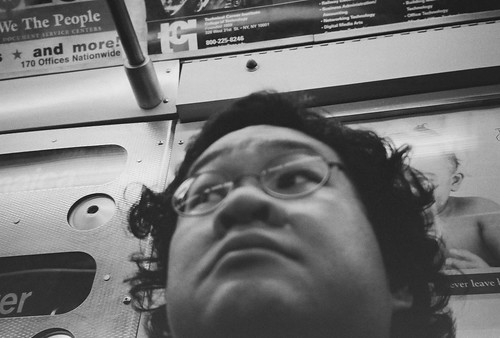
Here I was about five years earlier, on the NY subway.

164067-R1-E006
self-portrait ca. 2006, new york, fuji neopan 400

When I find one of my old cameras that still has film in it I usually have no easy way to tell when I made the pictures. This one happens to have been pretty easy.

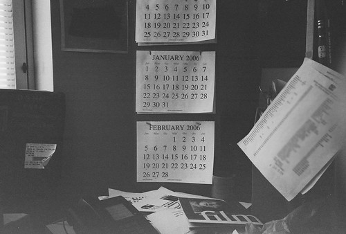
time to make the donuts
my desk, some of which looks much the same five years later.


I wanted to run a fresh roll through the camera. I was near Georgetown, so where was the closest place to get film? Urban Outfitters. I got a three-pack of Lomo's "fine (for fine-grain, I presume) color film." I don't know what part of it is the film, what part of it was overexposure due to an inaccurate meter, but the colors are washed out:

75750022


The cab was a darker blue. But high sunshine (and record heat) may have been a factor too. This seems about right.

75750019


I finished the roll trying to relive the glory days of my old boring aesthetic. I didn't quite get there, but this reminds me of the subgenre of boring photos I once played with, the establishing shot:

establishing shot

Saturday, July 23, 2011

photobook review: how terry likes his coffee, by Florian van Roekel

Article first published as Book Review: How Terry Likes His Coffee by Florian van Roekel on Blogcritics.

The ingenuity of Florian van Roekel’s How Terry likes his Coffee begins with the cover. With any photobook of these dimensions, you’d expect the pictures to be laid out in landscape orientation, and this is true of van Roekel’s photos. But the cover label is set in portrait orientation. From this angle, the plain black cover has the appearance of  a premium legal-sized notebook, which is exactly what you get when you open the book: a series of lined pages reproduced from such a notebook, with a variety of doodles both ornate and simple. Van Roekel’s subject is the office, and these are the very kinds of doodles you’d make in the middle of a boring meeting where you can’t be bothered to take actual notes.

This office paper trail recurs throughout the book, with blueprints reproducing the layouts of cubicles and other office spaces. The meat of Terry is the photography, but the meta-framework puts it into context and shifts our perspective as the photographs do.

The office is not uncharted territory: Lee Friedlander's At Work tackled the subject in a more photojournalistic vein (while still with his signature art) as he visited workers in factory and office settings. Van Roekel’s approach is more abstract. Rather than simply document the life of the worker, he breaks down the office experience into “chapters” taken at different and increasingly obscure viewpoints in a series of Dutch office buildings. The banal views of the water cooler and the weary office worker at the photocopier may be common. But then van Roekel goes deeper: a close-up of a stray rubber band at the base of an empty swivel chair. Ankle-level views close in on oxblood shoes and dark pants cuffs as workers busily wheel around their cubicle. Subjects are shot from various obscuring angles - from behind, from above, head on but with their face turned and covered by long hair. The people are lit so that their backgrounds often appear black, as if they are on stage. This is the office place as performance space, but a stage where the players are anonymous and interchangabie, in a interchangeable glass tower with interchangable flora that tries in vain to add an organic touch to the blandness inside. Instead, it’s locked out, and likely singed by the hot glass.

Who is the titular Terry, and how does he like his coffee? This is not made clear, though you might guess he’s the one with the Ubuntu coffee mug. As soul-destroying as office work can be, there are little consolations to make one’s dreary career pass more easily, be they doodles or black java. Is Terry a scathing critique of the office or a celebration of the people who toil in its dull conforming glow? The subject matter is loaded, but van Roekel doesn’t tell you how to feel. The artist’s eye simply immerses you in the details of that world. He does what artists do: takes the familiar and makes it strange.
As part of the PhotoIreland Festival, Martin Parr (Magnum photographer and co-author of The Photobook: A History) recently compiled a list of the Best Photobooks of the Decade. How Terry Likes his Coffee made Parr’s list. The book was just published in 2010, but its limited run of 500 copies made it scarce from the start. I lucked into one of a few copies the ICP bookstore got hold of this spring, and that’s probably the last time anybody will be able to get a copy for under three figures. The collector’s market for photobooks is heating up, as evidenced by an article in the Guardian  which notes that limited print runs all but guarantee that prices for good titles will quickly double or triple in value.  I wish I could tell you this didn't earn its costly stripes, but Terry is worth the hunt.

Friday, July 22, 2011

the bloggy, bloggy movie review: tabloid edition

Joyce McKinney
From Popcorn & Candy: Manacled Mormons and Androgynous Aliens Edition, July 14, 2011. See this week's movie roundup here. Also on (ironic definite article alert) The DCist, read my thoughts on Lindsay Rowisnki's Transformer Gallery installation Trying to be There (ironic awkward pronoun juxtaposition alert) here.


Tabloid

What it is: Erroll Morris' latest portrait of an obsessive looks at the strange case of Joyce McKinney, beauty queen -- and kidnapper?

Why you want to see it: Miss Wyoming 1971, Joyce McKinney could have had her pick of men. What made her not only choose bumbling Mormon missionary Kirk Anderson, but fly across the pond with a hand-picked team of accomplices to abduct him at fake-gunpoint? Morris told theNew York Times that McKinney was one of his most fascinating interviewees -- "if there was an Academy Award for best performance in a documentary, she'd win."

But Morris' new film is more than just a lurid story, although sensationalism is part and parcel of a tale in which a former Miss Wyoming ties a Mormon missionary spread-eagled to a bed and reportedly rapes him over the course of three days of, in McKinney's words, "fun, food, and sex." This Rashomon for the supermarket aisle is about how we tell stories -- not just the tabloids, but all of us. McKinney tells Morris that her training as an actress came in handy during her 1977 trial, and she performs for the camera today as surely and expertly as she performed for the jury thirty years ago. But we get no less a performance from Daily Express gossip columnist Peter Tory, one of the tabloid journalists who originally covered the story.

In the 1970s, rival British tabloids sold conflicting versions of McKinney as small town sweetheart and S&M call girl -- neither of which exactly lines up with her own version of the truth. For that reason, she has waged a campaign against the film. But is there such thing as a reliable narrator? Morris uses the visual language of tabloids in the form of contemporary newspaper clippings and of titles and fonts designed to mimic vintage tabloid graphics. Film footage is framed as if on a television screen against vintage wallpaper out of Diane Arbus. In other words, we all frame the truth through our own particular lens, and we are all performers -- even Morris. But some of us tell better stories than others. McKinney turned up in the news again a few years ago, but if you don't recognize the name, I won't spoil it for you. It just goes to show you that the best storytellers never stop telling stories. Like Joyce McKinney, and Errol Morris.

View the trailer.

Monday, July 18, 2011

every camera i own: the olympus om-1

The Olympus OM-1 was my first real camera, a hand-me down from my brothers. I started using this one in the late 80's and continued to use it through the early 2000s. Before I began acquiring  cameras - which not coincidentally was around the time I joined flickr,  it was my only camera.

I've had it shelved for ages - the meter died twenty years ago even after repairs, and the shutter speeds seemed sluggish the last time I tried it. But after years hauling around the Nikon N90 as my go-to film SLR, I was surprised how light the OM-1 is. I'd forgotten how easy it is to carry around. I ran into Chris Chen aka furcafe, and although he's not an OM-1 owner he admires the compact size - not much bigger than a classic Leica rangefinder, he pointed out (as he frequently does, he had a Leica for comparison). Chris pointed out that the shutter-speed controls on the front of the camera, around the lens, strikes him as strange - most cameras have shutter speed controlled by a dial on top of the camera. But this is how I learned it.

The earliest OM-1 shot I can find on my flickr stream, the late Willem Breuker, ca. 1996:

RIP Willem Breuker


I loaded my OM-1 with Fuji 200 and expected the shutter speeds to result in a lot of overexposed shots. But the roll turned out alright. This old school corner shop is home to the Capital Bikeshare station I use. It also seems to be the only place on the Hill where I can find Pom juice.

every camera i own: the olympus om-1

Olie's Trollie downtown - the blown highlights may be due more to my not compensating than to slow shutter speeds:

every camera i own: the olympus om-1

Friday, July 15, 2011

the bloggy, bloggy movie review

More highlights from my weekly movie column for the DCist. Visit the DCist for this week's column, See this week's column, Popcorn & Candy: Manacled Mormons and Androgynous Aliens Edition, in which I review Tabloid, the new Errol Morris film. I also reviewed three offerings from the Capital Fringe Festival this week, my favorite being the Pointless Theatre Company's Super Spectacular Dada Adventures of Hugo Ball.

From Popcorn & Candy: Technology is a Blessing and a Curse Edition, June 30, 2011


Larry Crowne

What it is: The second feature from writer/director/auteur Tom Hanks, whose portrayal of the lowly worker is a stark rejoinder to the oppressive hegemony of the Roumanian New Wave.
Why you want to see it: The titular Crowne (everyman a King, yo) is called to the front office at the big-box store where he works, boasting to his cow-orker that he's won Employee of the Month designation an Ed Rooney-esque NINE TIMES. [Ed. note: I had (and still kind of have) no idea who Ed Rooney was when I wrote this, but my editor inserted the additional qualifier.] But this time Crowne is a different statistic: he's laid off, allegedly because he lacks a college degree. And thus, multi-millionaire Tom Hanks (who I'm sure is a nice guy) takes an imaginary bullet for The People. Oh the catharsis! Hanks wrote and directed -- his first such project since 1996's That Thing You Do, which painted a picture of stardom in a more innocent time. But is this the right time for innocence? Is Forrest Gump II going to make America sleep better through this economic crisis? No, but Hanks' studied naivete magically transforms this picture into a live-action Spongebob Squarepants, in which the forbidden sexual tension between Spongebob and Squidward (Julia Roberts) is finally, subversively fulfilled. Co-written by Nia Vardalos of My Big Fat Greek Wedding fame; exercise extreme caution.

View the trailer NINE TIMES.
Opens tomorrow at a pineapple under the sea near you.


Rear Window

What it is: The AFI's Hitchhock retrospective continues with one of his greatest films.
Why you want to see it: Photo-journalist L. B. Jeffries (Jimmy Stewart) is holed up in his Greenwich Village loft after breaking his leg shooting an auto race. (Be careful out there, kids!) Bored and restless, he watches the comings and goings of his neighbors across the way. Rear Window is one of the classic thrillers. But it is also a case study in the power of photography, and of seeing. The film's main action takes place entirely in the space of one character's apartment, and what he sees from his window: the courtyard, a distant street, fragments of his neighbor's apartments, framed by their own rear windows. Does this presage the internet? People-watching has long been a favored past-time, and with a lens trained on nearly everybody it's hard to know where to look. Can what we see hurt us? This masterpiece from fabled voyeur Alfred Hitchcock examines the dangerous nature of photography while celebrating it with finely-crafted suspense and one of the great screen beauties, Grace Kelly. A Bernard Hermann score [I only realized after I wrote this that Hermann would not begin to collaborate with Hitchcock until The Trouble with Harry] might have made this a perfect movie, but Franz Waxman's treacly music serves as a fluffy counterpoint to the brooding danger within. Trivia note: the score is performed on screen by a young Ross Bagdasarian, creator of The Chipmunks.

View the trailer.

----

From Popcorn & Candy: Young and Misunderstood Edition, July 7, 2011


Psycho

What it is: The birth of the shower scene.
Why you want to see it: Marion Crane (Janet Leigh) is an office drone entrusted with enough money to blow Phoenix for greener pastures. Too bad she has a change of heart -- at the Bates Motel. Hitchcock's beloved avian imagery -- both predator and prey -- explodes a few years later in The Birds, but here it plays a more subtly sinister role: flight is arrested and animal urges are kept in check by man's own cages. What is the shower but a birdbath, the carving knife our hunger for fresh KFC? Psycho is the ur-slasher movie, the iconic shower scene the first in a long line of brutal punishments that are visited upon any sexually active bodies with the misfortune to find themselves in a horror film. Its influence goes far beyond the theater, to music ("Psycho Killer"), art (Douglas Gordon's 24 Hour Psycho), and even the collector's doll market (the shower scene became a liimited edition Madame Alexander doll). And thus, the film itself is like a phoenix: out of the horrific crimes of Ed Gein (who inspired Robert Bloch's source novel) rose something like poetry. Or is it kitsch? For all its strengths, the movie is flawed, the psychological exegesis ridiculous, the plot twists so much a part of the collective consciousness that it is impossible to watch it with the intended suspense. Then again, seeing the film with an audience helped Hitchcock realize the movie was, in fact, a black comedy. It may not be as funny as, say, Eraserhead, but rather a stark look at the arid morality of the American desert, an Oedipal western with Perkins as a troubled outlaw. And mother? She's the sheriff.

View the trailer.