Thursday, April 28, 2011

every camera I own: the nikon n90

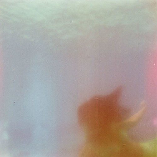
Painting by Veronica Ebert
The Nikon N90 was produced from 1992-1994. I've sometimes struggled with its autofocus and switched to manual focus, but this camera has the best meter I own.  I bought mine used from a colleague who also sold me a Hasselblad and gave me a Miranda, both of which I'll feature soon.  It came with a few Nikon-mount lenses, and this critical mass of glass which is what led me down the Nikon DSLR path rather than the Canon - but that is a story for another time. The N90 doesn't have the classic lines of an F-series Nikon, it doesn't take dreamy fuzzy pictures whose results are left to the serendipity that I treasure. I take this camera for granted, but it sees all and clearly, with lenses sharper than anything save my Hasselblad, but more intimate. 

I've taken the N90, usually mounted with an AF 50mm f1.8 (and later, an f1.4) with me to many far-flung places. And though it often takes a backseat to my Hasselblad and even my Holga (such are the perils of too many choices), and is sure to take a back seat to my iPhone next time I travel with both, I have made some of the pictures I'm most proud of with this machine. I have taken this reliable machine from New York

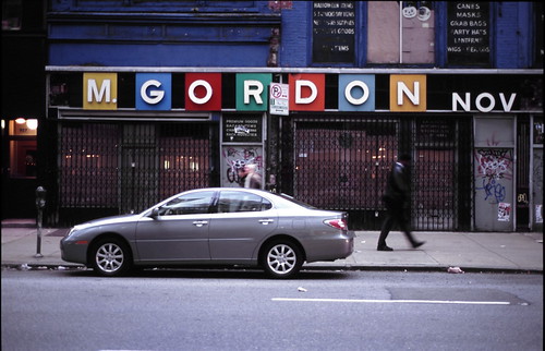
m gordon nov
Fuji Sensia 100, Nikon 50mm f1.8
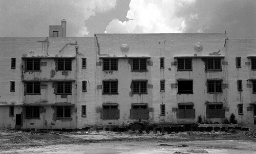
to Weeki Wachee

Fuji NPH 400, probably Nikon 50mm f1.8
from Miami

miami
Fuji Neopan 100, probably Nikon 50mm f1.8

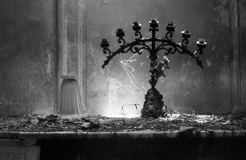
 to Buenos Aires:

Cementario de la Recoleta. Fuji Neopan 400, Nikon 50mm f1.4
from Washington, D.C.

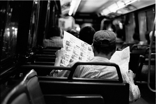
the bus ride
Tri-X, Nikon 50mm f1.8

to Eureka Springs, Arkansas

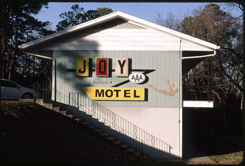
the joy of kodachrome
Kodachrome 64, Nikon 50mm f1.4
For this project I loaded the N90 with a roll of mildly expired (2008) Tri-X. It took me maybe a month to get through 36 exposures, mostly of family, and I didn't drop off the film with the sense of mysterious anticipation with which I often drop off film that expired decades ago and which I ran through light-leaky plastic cameras, from which I feel lucky to get an image of something I recognize. No: this camera knows what it's doing - and sometimes that's a good thing:

Royal Family Bowling Center, Front Royal, Virginia

Maggie and Julien


Tuesday, April 26, 2011

photobook review: Jason Fulford, Raising Frogs for $ $ $

My week is growing ever so slightly longer but I hope to be caught up soon.  Somewhere, there are baby frogs. I would like to go there with you and raise them for free. Article first published as Book Review: Raising Frogs for $ $ $ by Jason Fulford on Blogcritics.

Spring and the Easter season are a time of growth and rebirth no matter what tenets you hold dear. So whether your chosen tale of redemption is fluffy or contemplative, let us presently examine a work that may not directly be tied to vernal urges, but gently plants visual seeds that we may water to fruition.

When you first regard Raising Frogs for $ $ $ (The Ice Plant, 2006), the cover calls your immediate attention. It looks like no other contemporary photobook: just one look, and you throw the old adage out the window: this robust fire-engine red binding with the illustrated frog and plain embossed font - dollar signs curiously rising as if bellowed from the frog itself - *demands* judgement. It looks like something out of your grade school library.

The dry hilarity of first impressions gives way to an enigmatic sequence of images. A suite, if you will: eight sections of images are presented, marked off by roman numerals to further the vague impression of some scientific thesis. Some sections make more apparent sense than others: one offers a succession of near-Escherian planes, in the sharp and staggered corners of a quaintly wallpapered corner or the entwined branches of a tree. Other groups of images suggest man’s encroachment on nature, but what messages there are to be found are not heavy-handed or obvious. Fans of Fulford’s recent The Mushroom Collector know that his sequences may seem haphazard but are far from arbitrary. Fulford said of Raising Frogs for $ $ $, his second monograph, that "The intention of this edit and layout is to create as many relationships as possible between the pictures as well as the chapters. I like the idea of a meticulously planned-out event that remains unpredictable." Fulford's photobok aesthetic has grown brilliantly from the auspicious, if more modest debut of Crushed, through Frogs and culminating in last year's Mushroom Collector. What will he come up with next? Enjoy the process.

Friday, April 22, 2011

every camera I own: the dick tracy 127

A gift from V.
The Dick Tracy camera was produced around 1947. There are several other bakelite cameras that look just like this, like the MajesticPickwick, and Falcon, but have different face plates - one of the keenest variations on this model is the  Brenda Starr  camera. I can't figure out what the ur-brand is of this camera but "Seymore Products Co.", as well as Falcon, originate in Chicago. This is essentially a half-frame camera - it makes sixteen images on a roll of  8-exposure 127 film.  There are two frame-windows on the back; I've been careful to tape up the frame windows to prevent light leaks, and I only peel back the tape when advancing film.

A full-frame 127 exposure produces a somewhat larger negative than 35mm film.  I sometimes see 127 referred to as medium format, but I don't know about that. If 35mm is bantamweight (like the Kodak Bantam, whose 828 film spools are similar in size to 35mm), then 127 is welterweight, but middleweight does not weigh in until you get to 120. Still, I am throwing around boxing weight classes with only a passing (read: I looked them up on Wikipedia) knowledge of them. Go ahead, call it medium format if you want; lives do not depend upon it.

You might think 127 is a long obsolete film format.  Kodak did stop manufacturing it in the 90's,  but this welterweight gauge is in fact still in production from companies like Efke,  Blue Murano, and even Rollei. The august German manufacturer introduced black and white 127 stocks just a few years ago, perhaps tailored to the legacy of their Baby Rolleiflex, a less expensive alternative to its even more prized medium-format big brother.

I've used some of these new 127 stocks with this camera before.This is the lovely Bluefire Murano - note the minor light leak at the top of the frame:


I have fresh(-ish) Bluefire Murano stock at hand, but as is my wont I used an eBay acquisition of long-expired (ca. 1961) Verichrome Pan. And it turned out fine, if a little wanting in contrast after all these years. This Midas franchise is Winchester, VA:


A small park in my neighborhood. The backing paper bled through a bit here. I was inclined to thank the camera for the fact that there are no details here that would make you think this image was made in 2011, but maybe a sharper image would not have revealed the times. Or are those rooftop spikes antennae?

Monday, April 18, 2011

(meta) photobook review: publish your photography book, by darius d. himes & mary virginia swanson

A day late. Article first published as Book Review: Publish Your Photography Book by Darius D. Himes and Mary Virginia Swanson on Blogcritics.

It has been said many times that we are living in a golden age of the photobook. We are also living in an age when more and more photographers are making their work available online, via social networking/sharing sites like Flickr or Instagram, and through a growing number of self-publishing print-on-demand outfits like Blurb and Lulu. As one of these legions of photographers, I have personally partaken of each of these companies' services. The social and professional rewards have been significant in my life, but as the pool grows more and more varied, one can’t blame the emerging photographer for feeling lost amongst what seems an endless array of semi-professional choices. How does one maneuver this vast and changing landscape?

Darius D. Himes and Mary Virginia Swanson do a great service to the lost and the semi-found in Publish Your Photography Book, issued by Princeton Architectural Press. After an introductory chapter on the histor of the photobook, the authors guide the photographer through each step in the process - from concept to marketing - of making a distinct product of your own. The cover of the book neatly immerses the reader in the world of publishing (and is a handy short-cut for cataloguers as well), listing the paper stock and printing specs of the very book is in your hand - and it will be in your hand if you are at all serious about getting your photography into the physical hands of your audience.

But how do you begin? What are the mechanics of the process? Who is your audience? Your questions are here answered in text-book precision in this tome - whether you are an aspiring Jason Fulford, whose wonderful, unique photobooks like Raising Frogs for $ $ $ and The Mushroom Collector have been printed in the limited runs of an art publisher; or an aspiring Anne Geddes, whose Geddes’ coffee-table books of infants in flowerpots and other horrors sell by the minivan-load. For those image makers with a more personal vision, but lacking in practical considerations, there is plenty to learn from these chapters, perhaps none more valuable than the closing case studies, which include illuminating interviews with the likes of Alec Soth and John Gossage, to pick two of he most consistent producers of thoughtful photobooks today. The one thing this book won’t give you is a concept. That is up to you - and me.

Tuesday, April 12, 2011

SERIAL, which is offered to you dear reader in lieu of an every camera I own missive this week only

I may not be able to squeeze in an "every camera I own" post this week, owing to the fact that my corner lab can't do b&w 127. I hope it doesn't end up fogged like my last few camera rolls. The film is on its merry way to Parsons Kansas, where Dwayne's Photo, no longer beset by ark-loads of Kodachrome, can process it in their timely fashion - but I figure it won't be ready for at least a week.

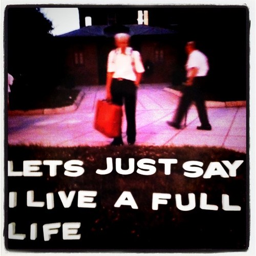
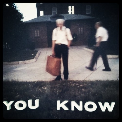
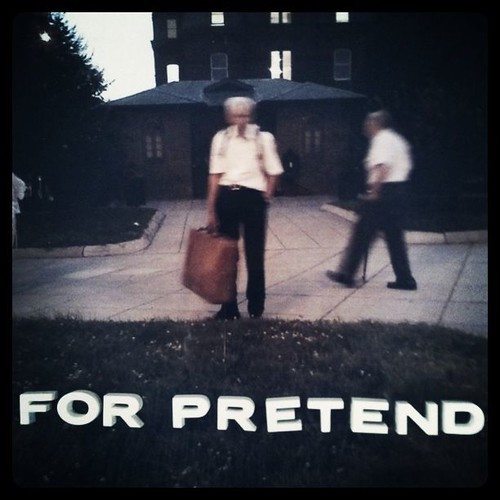
So in lieu of a camera post, I offer you, gentle reader, a new photographic series accomplished with a camera I've already written about: my iPhone. But first some background. A few years ago I presented an Ignite DC talk about Mittens Movie Titlers, a set of plaster letters marketed to home movie makers in olden times and such. You can watch my presentation (I personally would be afraid to be peppered by all those umm's again) on YouTube,  and see some of the pictures I made with them on  Flickr. Anyway, that was a few years ago, but in recent months two different people have approached me with similar sets. I have to thank filmmaker Jeff Krulik for offering a set of pinless Mittens, which had somehow eluded me even though I was already the proud owner of three sets of the pinned variety. The pinless set were meant to be used with a dab of Mittens brand STIKUM, which of course is long dried out. But the pinlessness makes the letters more versatile, for placement on surfaces which would be damaged by poking - like, say, the body, a bridge I have yet to cross.

Anyway, just a few weeks ago my friend Robin gave me a more portable set of letters from a company I'd never heard of, Hernard (and already, if you Gooble "Hernard Title Letters," my Flickr set is the top hit.  These letters are of more recent vintage than Mittens, and as the instructions say they were marketed to photographers on the go. The letters originally had a self-stick adhesive that allowed you to place them on - as the instructions suggest just for startes - luggage or a car window,  to make your vacation photos, well, textual. Of course the adhesive had long worn off, but the portability of the set (the plastic box is maybe one-eight the size of a cardboard  box of Mittens letters) is still an asset. My sets of Mittens have letters neatly organized into snug slots, but these Hernards are loose and unorganized, which encourages on-the-fly composition (of a textual, not photographic nature). And yet the results are also ephemeral - the relative ease of arranging letters (if, like me, you eschew things like kerning and straight lines) encourages spontaneity.

My first experiments with Hernard letters consisted of single words spelled out on the plastic sheets that originally held the self-adhesive letters  - you can see traces of adhesive on the sheet if you look closely. This was the first word I spelled out with Hernard Title Letters:

I graduated from that to spelling words  on images from whatever  books images I had laying around. This is from The Butlin Holiday Book 1949-50, issued by the famous resort:


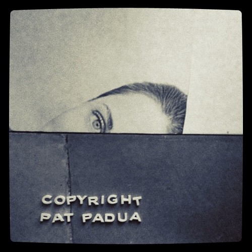
And from that to my own images, at least the ones I've had printed. The images of G.P. Fieret have made me reconsider the practice, which had always annoyed me,  of watermarking images to prevent theft. Fieret used custom ink stamps and hand-written signatures directly on his prints. Barring the artificiality of Photoshop-embedded notices, I thought the Hernard letters would be a bold alternative:


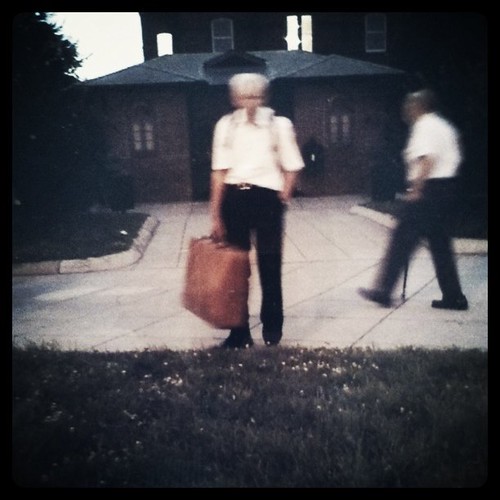
And finally, serial narrative, my first experiment with which I tried just tonight.


SERIAL NO. 1


SERIAL NO. 2


SERIAL NO. 3


SERIAL NO. 4


I think it has legs.

Sunday, April 10, 2011

photobook review: images you should not masturbate to

Welcome to another round of photobook reviews, brought you you by another pile of books I bought a while ago etc. Article first published as Book Review: Images You Should Not Masturbate To by Graham Johnson and Rob Hibbert on Blogcritics.

Images You Should Not Masturbate To is a modest tome published by the Penguin Group. You’ll likely find in the Humor section of your neighborhood bookstore, but as a collection of images, it fetishizes the footsteps of not a few modern photographers. From the “Beauty of the ordinary” found in the work of Stephen Shore and William Eggleston, to the celebration of tedium in the Boring Postcards books compiled by Martin Parr, to the vulgar, saturated slices of life in Parr’s own photographs, blended with some of the conceptual irreverance of Richard Prince or John Baldessari’s appropriated works. For its august and esteemed pedigree, the title and sequencing puts such imagery to a markedly different use.

Taken from the work of three credited photographers and a stock company, the selected images are for the most part visually arresting, although in many cases, it is in the sense that you can’t avert your eyes from a tragic accident, no matter how acute and persistent the psychic scars. Thus the cover of this little book pulls no punches: a naked grey-haired man standing thigh-deep in what appears to be an ice-fishing hole, wielding an axe and captured mid-swing. It is possible that readers exist who would indeed masturbate to such an image, as well as to images of grown adults wearing push animal costumes, a hairy-legged man with SPEEDO emblazoned across the back of his swimming trunks (straight out of Martin Parr, eh?), or a Golden Retriever defecating in a park.

 Do we laugh as we pass judgment on those who would find these images arousing? Is our laughter nervous as we spot an elderly woman gleefully playing the piano, or an underexercised man wearing briefs and a rabbit mask in a setting reminiscent of The Wicker Man? Nobody could possibly be aroused by a stark image of a salt-shaker set against a dark formica tabletop, or a styrofoam container filled with raw sausage links. Or could they? Such is the humor of discomfort that we may never know, and the power of visual imagery that we are drawn in regardless. Stumble upon this jeremiad in your neighborhood bookstore and you may rifle through its pages in the matter of a few minutes and return it to the shelf. But some of you may be amused enough to purchase same and bring it home. Take a good look at yourself, gentle reader, and ask yourself: WHY?

And get this - it's also available for your Kindle, an image of which is sure to make it into Volume 2. While there are no lunch boxes in the works that I know of, you can also join the book's Facebook group.

Thursday, April 07, 2011

every camera I own: the brownie hawkeye flash

The Brownie Hawkeye Flash was a simple Bakelite box camera. There are no adjustments to speak of; you look through the viewfinder up top, and you depress the shutter; the grey slide opposite the shutter release can be pulled up to allow bulb exposures. The camera was produced from 1950 through 1961, so there are a lot of them out there. If you pay more than $20 for one of these, you're paying too much, and they can be still be found for considerably less. I own three of these cameras, but one in particular is most uncommon.

I call this Brownie "Yerm," after the manufacturer's date code that indicates this product left the factory in April 1953. It cost me $10 at Blue Moon Camera in Portland, Oregon, where I had just performed, under the authority granted me by Rose Ministries, the marriage rites for two friends who had met on Flickr. But that's another story. The Brownie takes 620 film, which is the same size as 120 but with a smaller spool. Unlike many cameras that take 620 film, the Brownie Hawkeye was built with enough tolerance that you can trim off the edges of a 120 spool with heavy-duty nail clippers and it will fit perfectly.

A perfectly preserved Brownie Hawkeye Flash will produce fairly sharp pictures  for a Bakelite toy. But this Brownie was special. This is one of the first pictures I made with it:


This Brownie had a bad case of mold on the lens. The moldy lens puts everything in soft focus and lends highlights an otherworldly glow:


I've run a lot of film through this camera - you can see more than a hundred pictures I made with Yerm in this Flickr set. The camera has served me well. But I dropped it in Eureka Springs, Arkansas a few years ago,and that led to some light leaks, which is the cause of the pink edges in this picture taken at Weeki Wachee Springs in Florida:

through weeki wachee softly

If I run an entire roll of film (twelve exposures) through the camera in a short time period, stray light doesn't have as much of a  chance to affect the image. But if I leave a partially exposed roll in the camera, and put it aside for awhile, I end up with fogged film, even though I have taped up the frame window. That's what happened with this week's installment of Every Camera I Own. This is the last frame from a roll of Verichrome Pan that I had left in the Brownie for some months:


What you should see is a view atop a high concrete staircase in Georgetown where the climactic scene of The Exorcist was filmed (the iPhone photo of the Brownie at the top of this post was made at the bottom of the steps. You'll have to take my word for it that I climbed my way here). Somewhat more recognizable is this image of lights, but I can't remember what they are or even if this is the right side up:


Oriented as is, the lights could be cast from an out-of-frame window above; with the lights on the side of the frame, they could be a series of windows. The only image on this roll I recognized was this:


The dome of St. Matthews Cathedral, the church where my parents were married and where my mother's funeral was held. 

I'll try again.


Sunday, April 03, 2011

photobook review: Foto en Copyright by G. P. Fieret, Vol. 2

With this review I finish writing about the stack of photobooks I bought in January (and with this post I'll start keying "photobook" as one word, a usage which seems to have legs. Although the results of a "photo book" google search are nearly five times greater than that of the one-word search, the cool kids are going for the the latter. Anyway, I've stopped buying books for a while but before my sabbatical from hoarding began I binged on another stack of photobooks. A stack that, um, may be even bigger than the stack that inspired this project I started for myself. ( The Japanese photobook Domestic Scandals,  which I wrote about a few weeks ago, is from this new pile.) Blame it, if blame you must  on what might be called Retail Therapy but, after professional consultation, may more accurately be termed Retail Treating Surface Symptoms By Covering Them Up Superficially And Not Really Filling The Void At All Not Even A Liddles. At any rate (really, at the rate of once a week, which I've barely missed the last few weeks but chalk it up to getting home late from Saturday family visits), I'll continue writing about photobooks singularly or plurally. I'm a little intimidated that Walker Evans's classic monograph American Photographs is in this queue, because I find it easier to write about the lesser known and the previously unfamiliar (to me or to you) than about one of the undisputed classics of the form.

Anyway, the following article was first published as Book Review: Foto en Copyright Vol. 2 by G.P. Fieret on Blogcritics.

A G. P. Fieret iPhone app would be easy to design. It would be something like DoodleBuddy: you can choose where to place circular copyright stamps, and how many; select and address stamp with the artist’s full name; select and size the artist’s signature. Desaturate, add contrast and grain and there you go: a basic template for the photographer’s signature look. But as with life, art is not as easy as it looks. Behind the over-protective copyright marks, which may seem like a gimmick but was born of paranoia, the vision behind the late photographer’s unadorned images is genuine. And if particulars can be imitated, the essence is unique.

The Fotomuseum den Haag released its first collection of G. P. Fieret’s striking nudes and street photography in 2004, in an out of print edition now prized by collectors. So by popular demand, the museum has issued Foto en Copyright by G. P. Fieret Vol. 2, a selection of another 160 photographs from their archive of 2500 prints from Fieret’s studio. Sadly, the artist died in early 2009, but he left behidn a vibrant and original body of work. This volume scales back a little on his trademark copyright stamp and John Hancock, though these are still well represented. But after that aesthetic jolt, the chance to some of his prints without the distractions give you a view straight from Fieret’s remarkable eye.

In a world full of street photographers it can be hard to stand out, and while nostalgia and unfamiliarity helps make these images from Hague streets in the 60’s strange and new to American audiences, the grainy vision, stark but also human, is always evident: in the party-hatted elderly attendees at a museum opening; in an intimate portrait of Japanese artist Yayoi Kusama; in masked biddies on a parade route ; in a child taking her baby doll for a stroll. And throughout, there are Fieret’s women, fully engaged with the artist, and clothed or disrobed they really do make love with their eyes to the man behind the lens. Cats provide the occasional accent to his human landscapes: one white feline regally stands guard as a near abstract counterpoint to the daisies gracing the black maw of an underexposed garden background. G. P. Fieret will not remain underexposed. Get this while you can.

Friday, April 01, 2011

every camera i own: the iphone

It's the first week of spring but the weather hasn't been conducive to photo walks with old cameras that have limited controls and need good light to get a decent exposure. And really, I've been unmotivated. The self-guided projects  I've assigned myself give me some sense of occasional direction but there are frequent nights when Saturn wins and I want to hide under the covers with a bag of Chips Ahoy. So far, I've resisted the crumbles, cookie-wise. But please don't talk to me about Doritos.

Many days and nights, sun or rain, the only camera on my person is an iPhone, and that has become my go-to lens even when I'm carrying other cameras - my Canon S95, to name just one instance,  has lain fallow in my satchel for weeks. But the iPhone is there, its apps calling me like crack to a back-alley whore, allowing functioning asocial members of society to connect and detach. Hi.

It is maybe a little ironic that the picture above was talken with one of eleven filters available for the Instagram app, which is the new share tool for people who share their photos taken with the Instagram. I've been on Flickr for the better part of a decade now and that is still my primary photo-networking outlet, but the company has yet to come up with a more than barely adequate app. So I can understand why Intasgram is popular. It allows for easy sharing and browsing and also comes with those keen filters, which increase or decrease contrast and saturation to a finite variety of degrees, many of which you end up cycling through as you decide whether to Lomo-fi your picture or Kelvinize it. I think I'm Cross-processed (a filter named for the analog practice of developing E6 transparency film in chemicals for C41 negative film, or vice versa) above.

But as far as image manipulation goes, the golden statuette goes to Hipstamatic, an app that pretends to be a film camera: you select "films," "lenses," and while all this processing is going on the app even tells you to wait while the "prints" are "developing."

If those seem like quotation marks of disapproval, perhaps the disapproval is a kind of analog self-loathing for digital transgressions. Before I had the opportunity to try the myself I'd regard friends' Hipstamatic photos with mixed emotions of scorn and jealousy. "Oh, that's cheating," I'd silently pshaw, not taking into account any number of darkroom tricks that have accompanied photography since the beginning of the medium. Chemical techniques of course require a far higher skill level and lower tolerance for error than downloading the free Tejas "lens," which in combination with the Shibuya-themed Float "film" results in a nicely subdued palette. Which I can now share.

The filters are keen and frankly addictive, a neat tool to have in the toolbox, and convenient too. The results may be easy to dismiss in terms of effort, but such ease of use does inspire aesthetic experimentation. Is this somehow a metaphor for the 21st Century Condition? Every generation seems to be distracted by a new set of cave shadows, and someday a new technology will make the iPhone seem quaint. But the old technologies are  still there calling from rotary phones and reminding you of the satisfaction of turning that dial and cocking the shutter. Tomorrow I will shoot real film. And take a real nap.